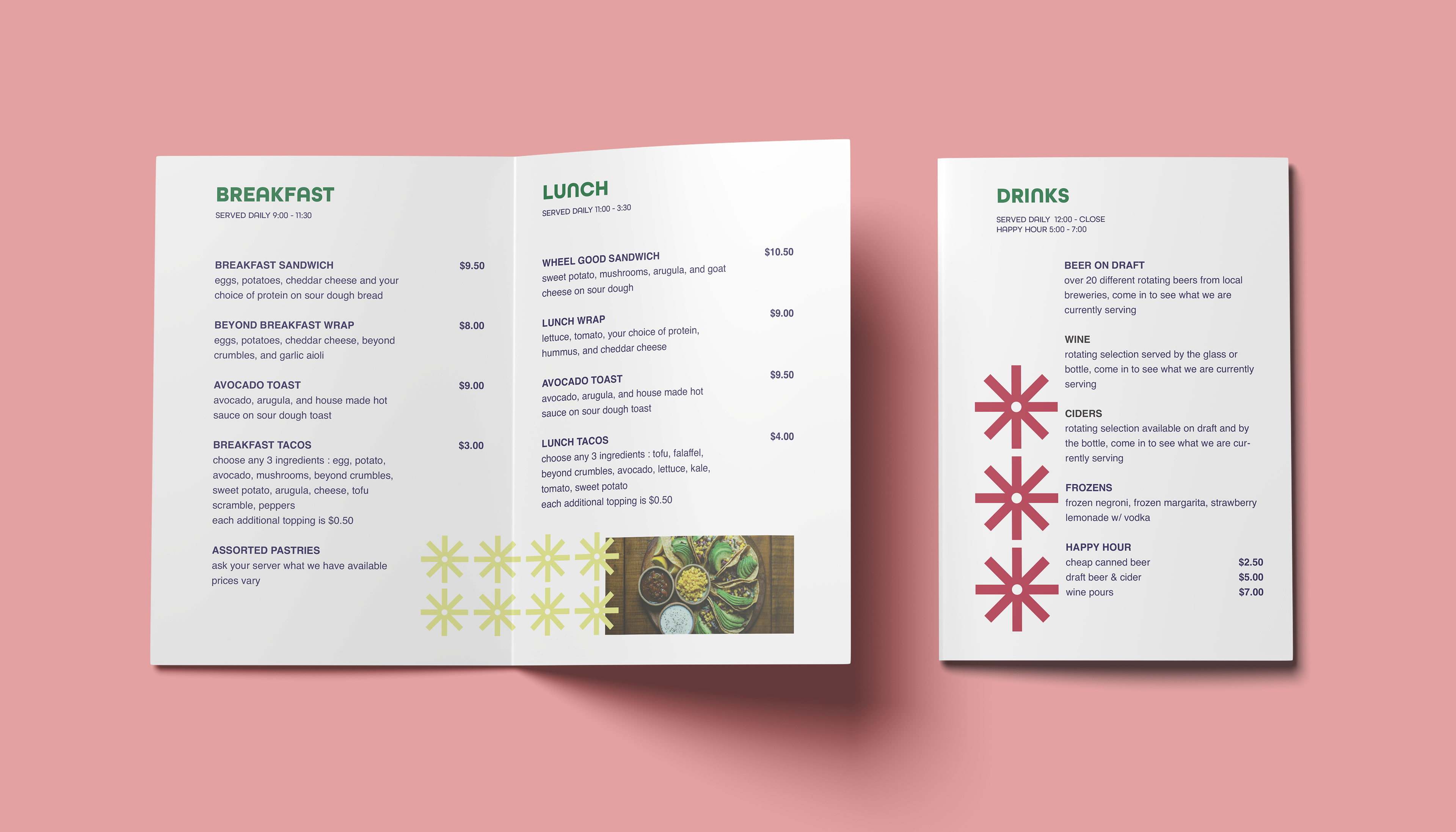
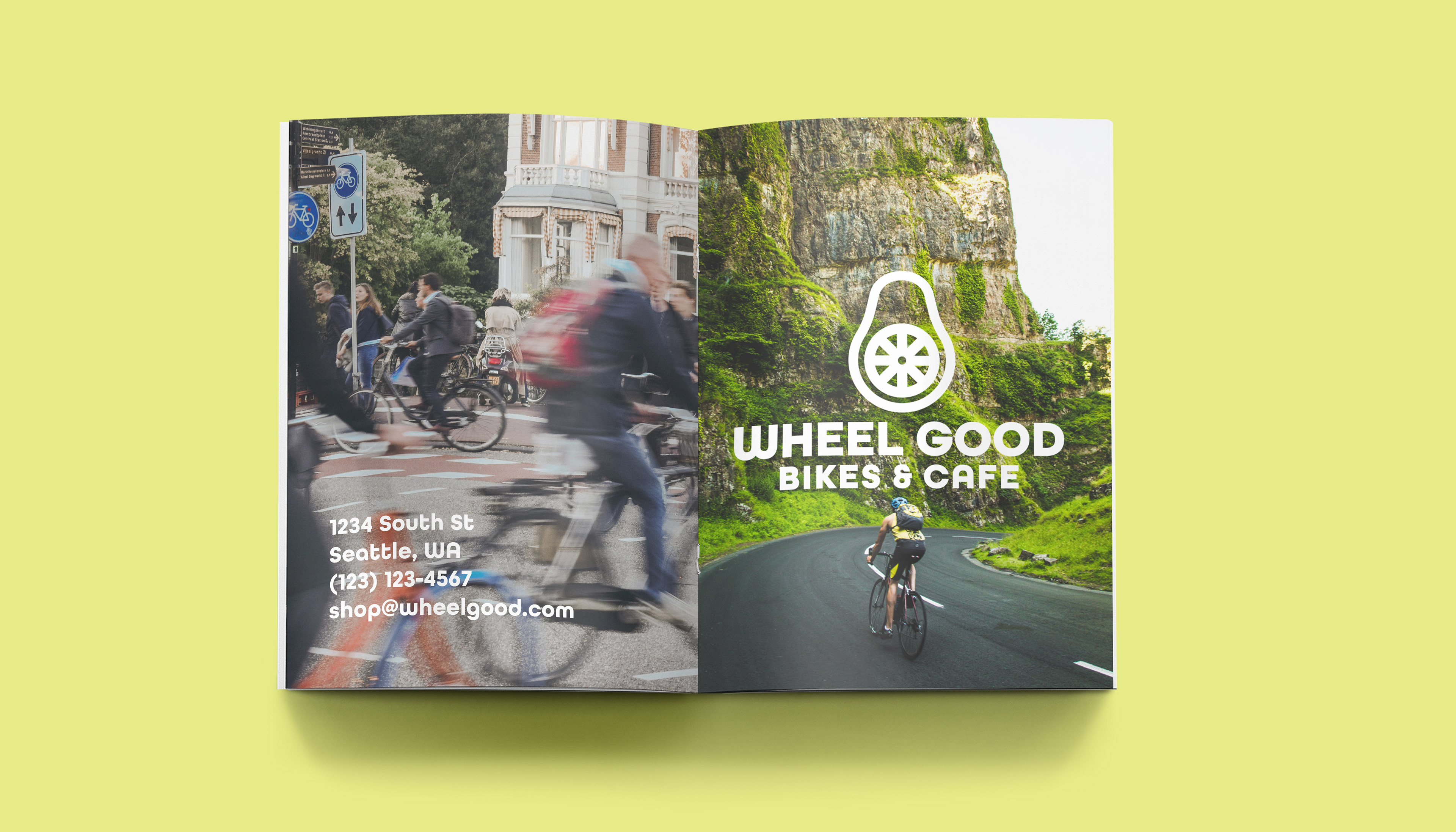
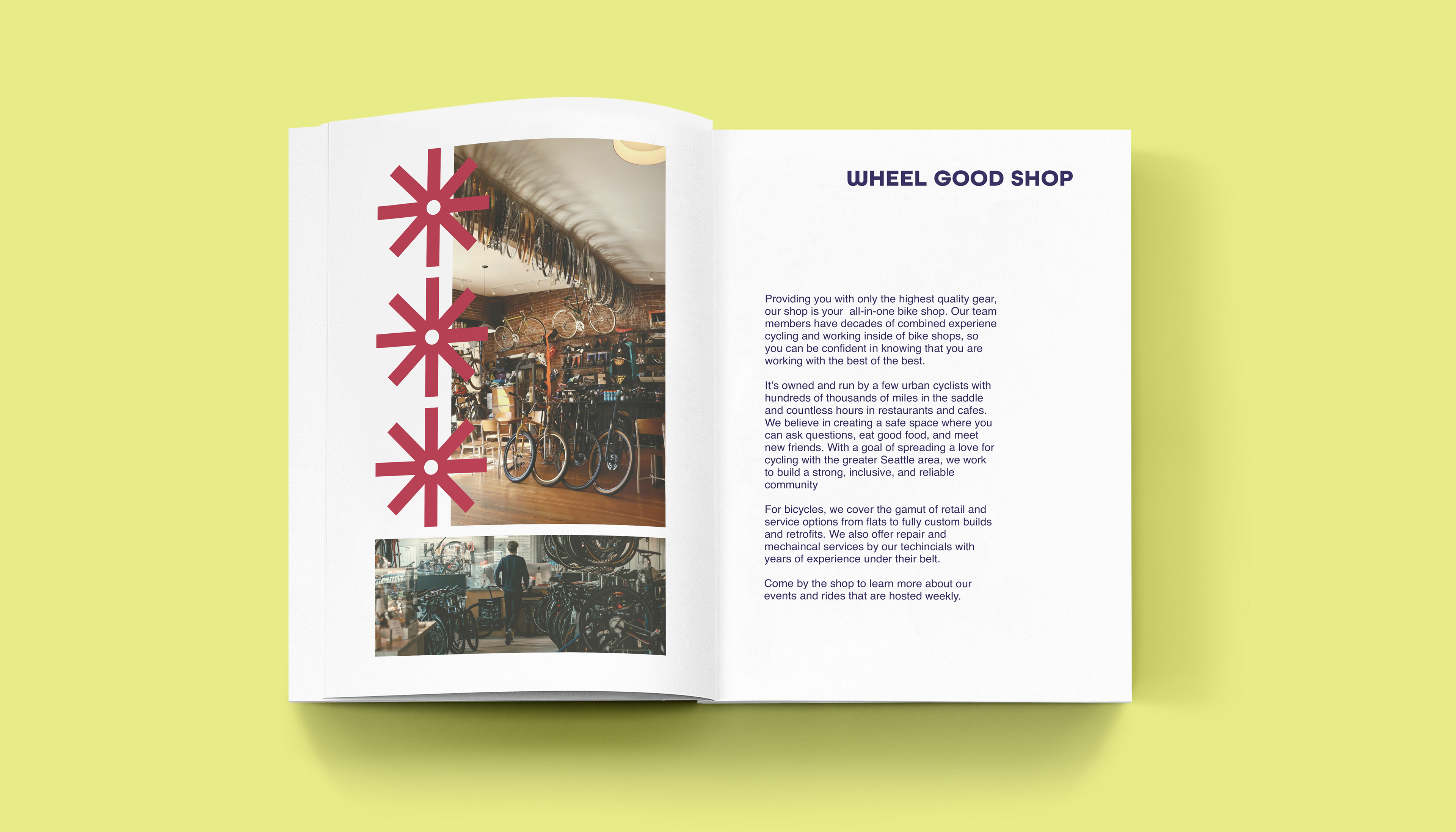
BRANDING & TRADEMARK DESIGN
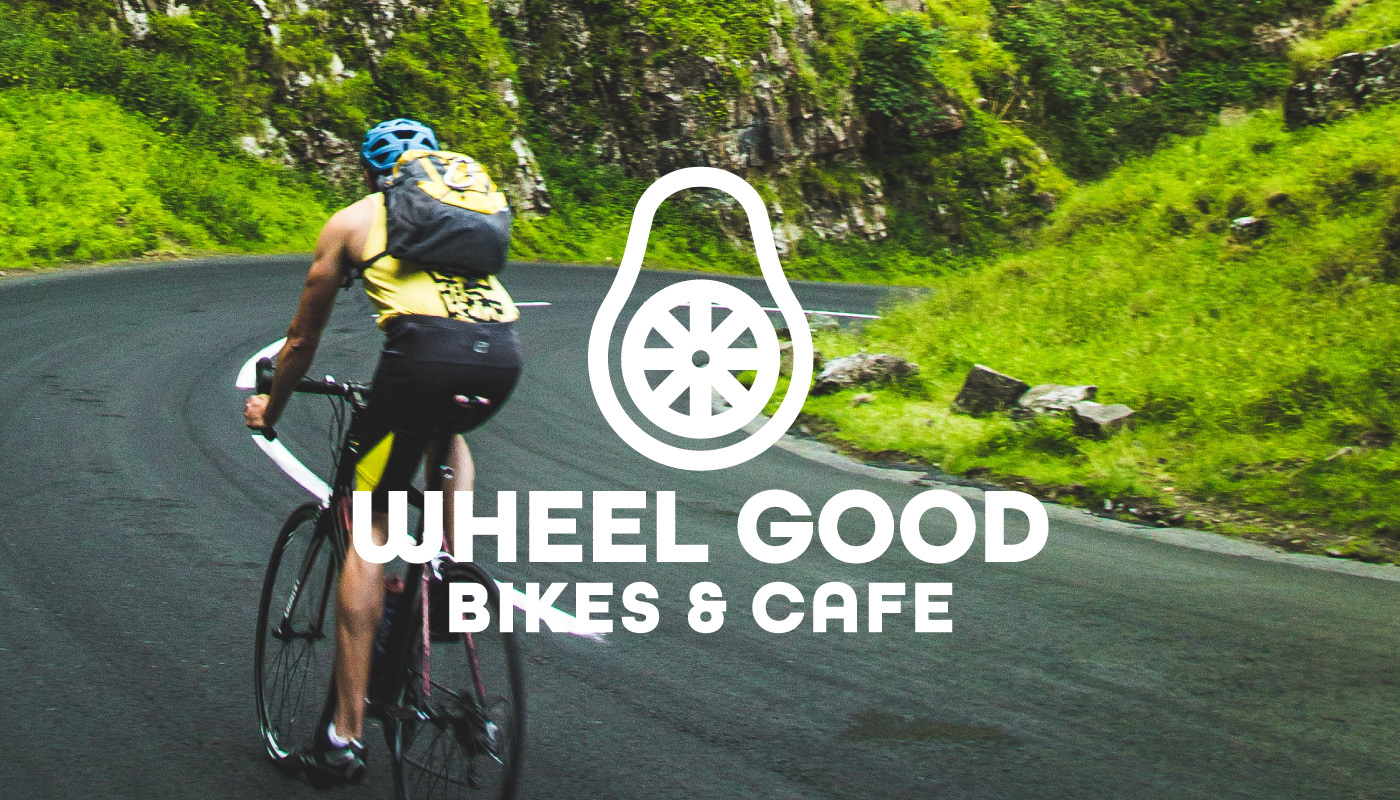
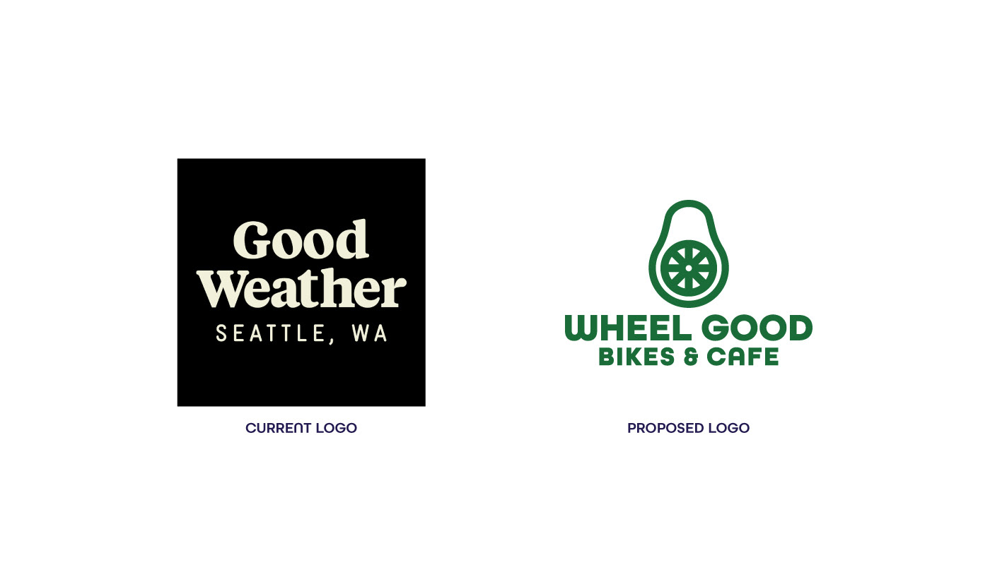
OBJECTIVE: To create an inviting and fresh proposed rebrand for Good Weather Bike Shop & Cafe based on their brand voice of being centered on high quality products, and healthy plant-based foods.
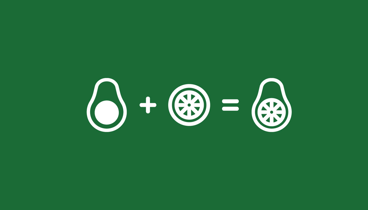
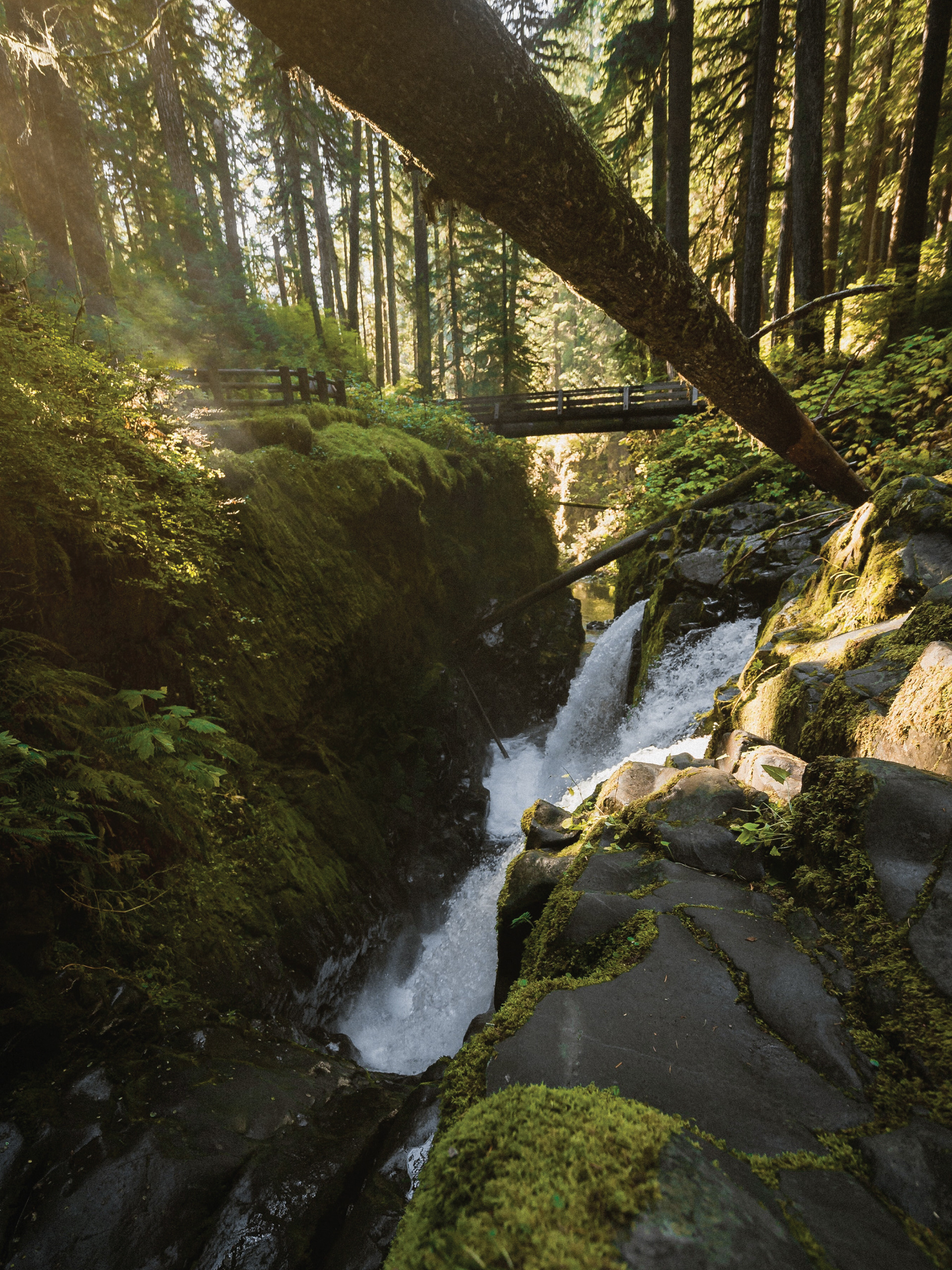
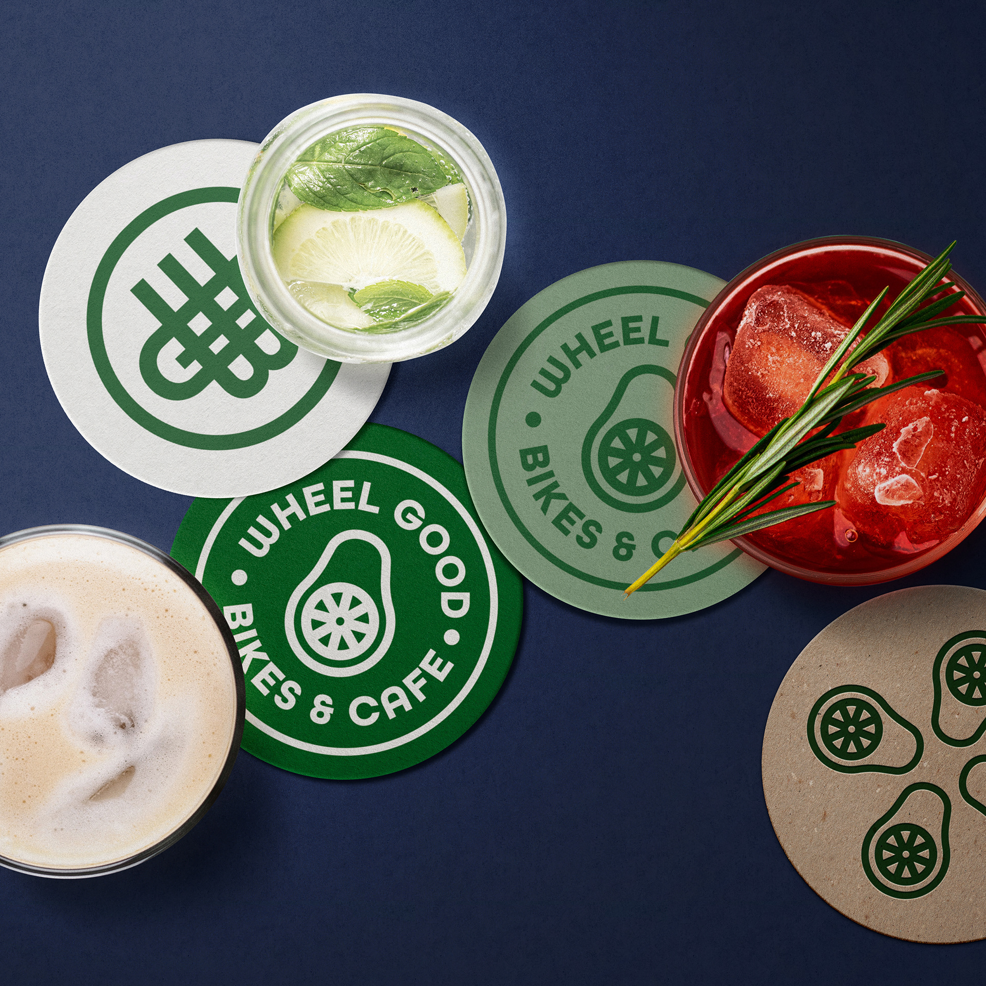
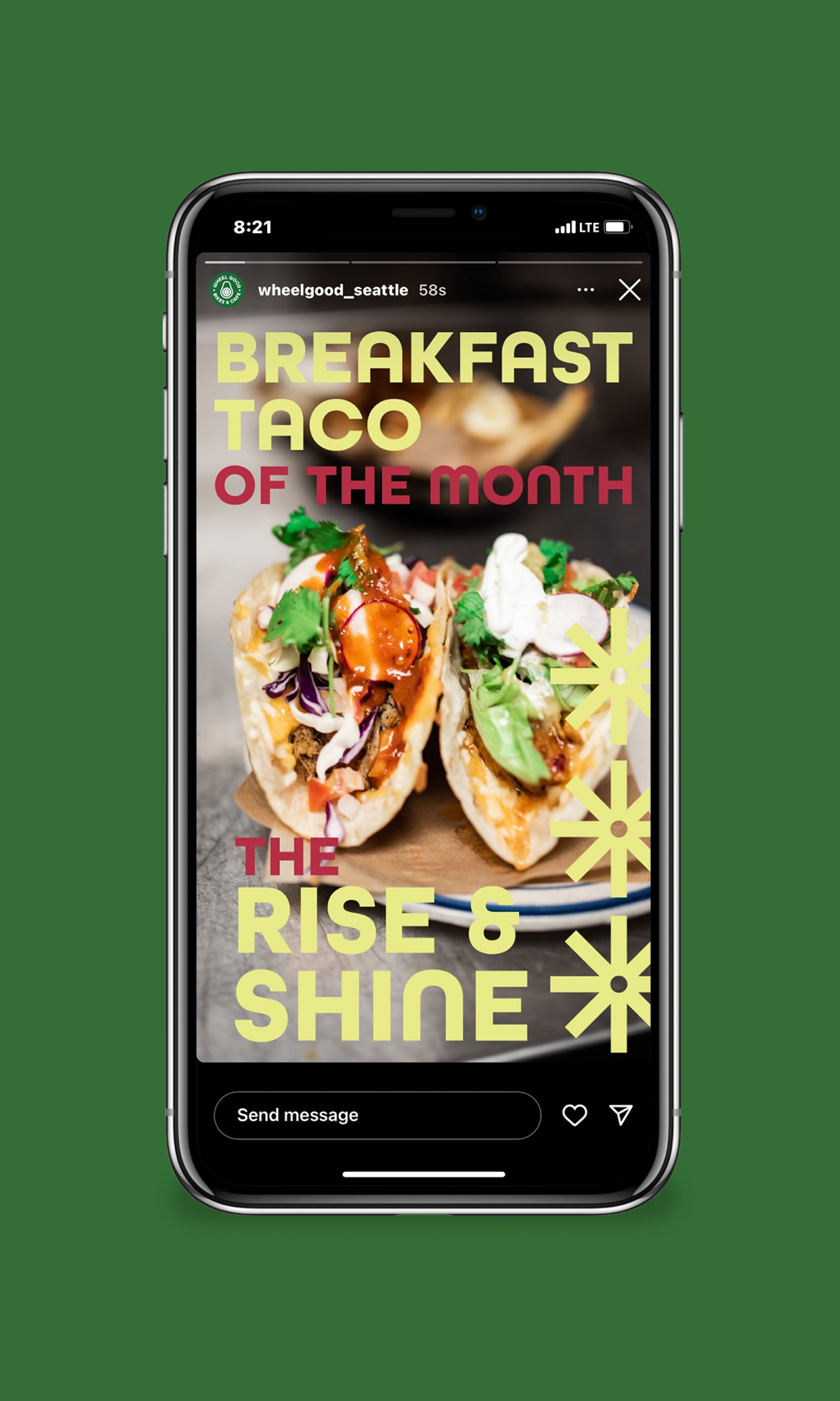
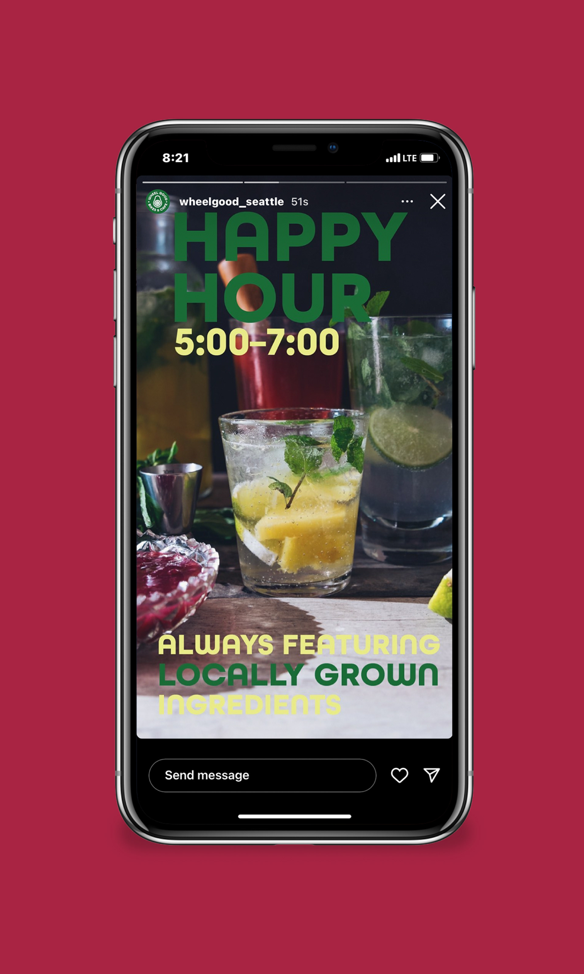
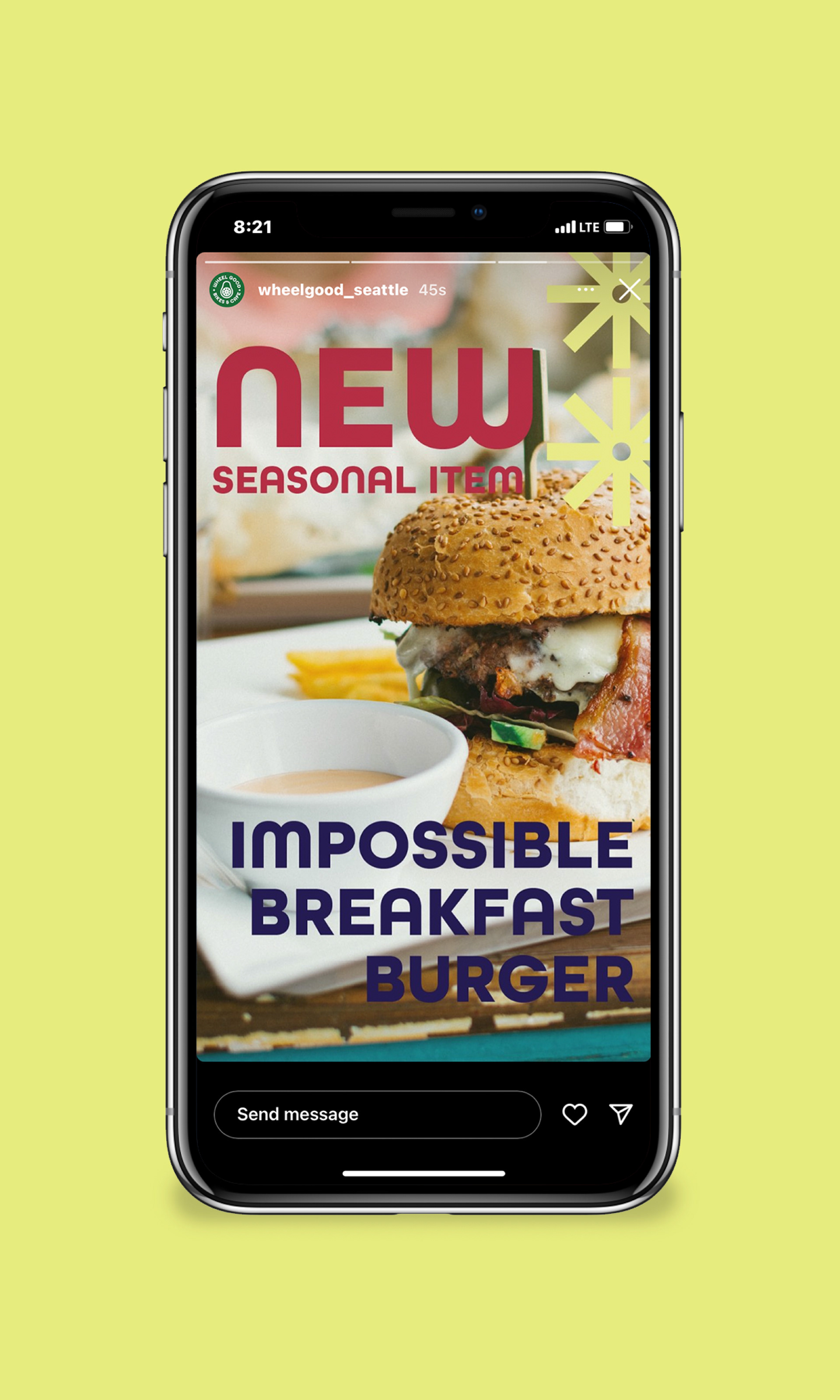
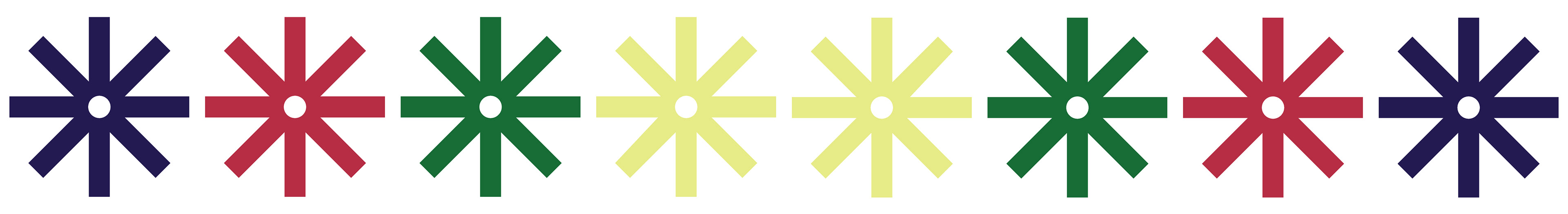
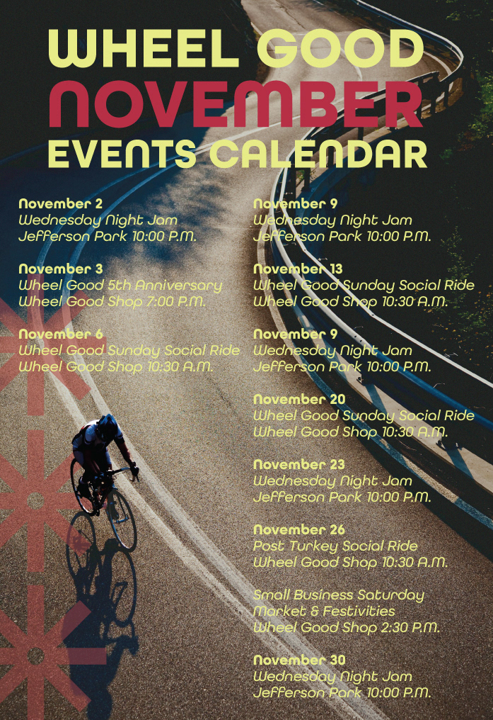
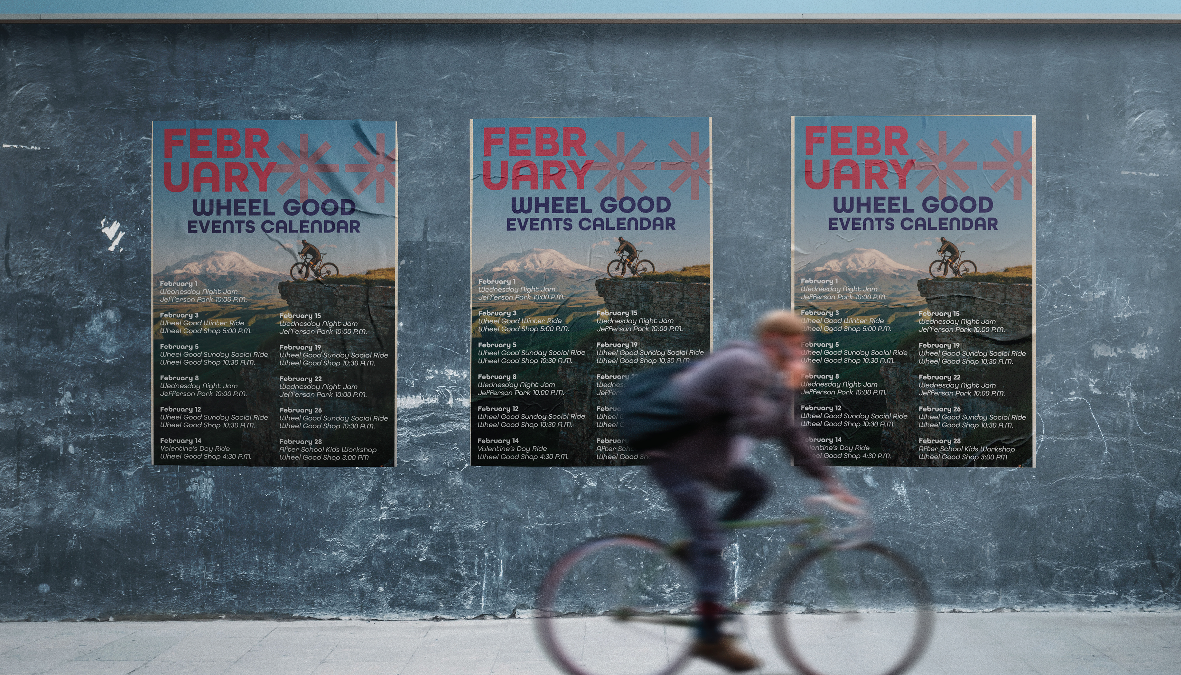
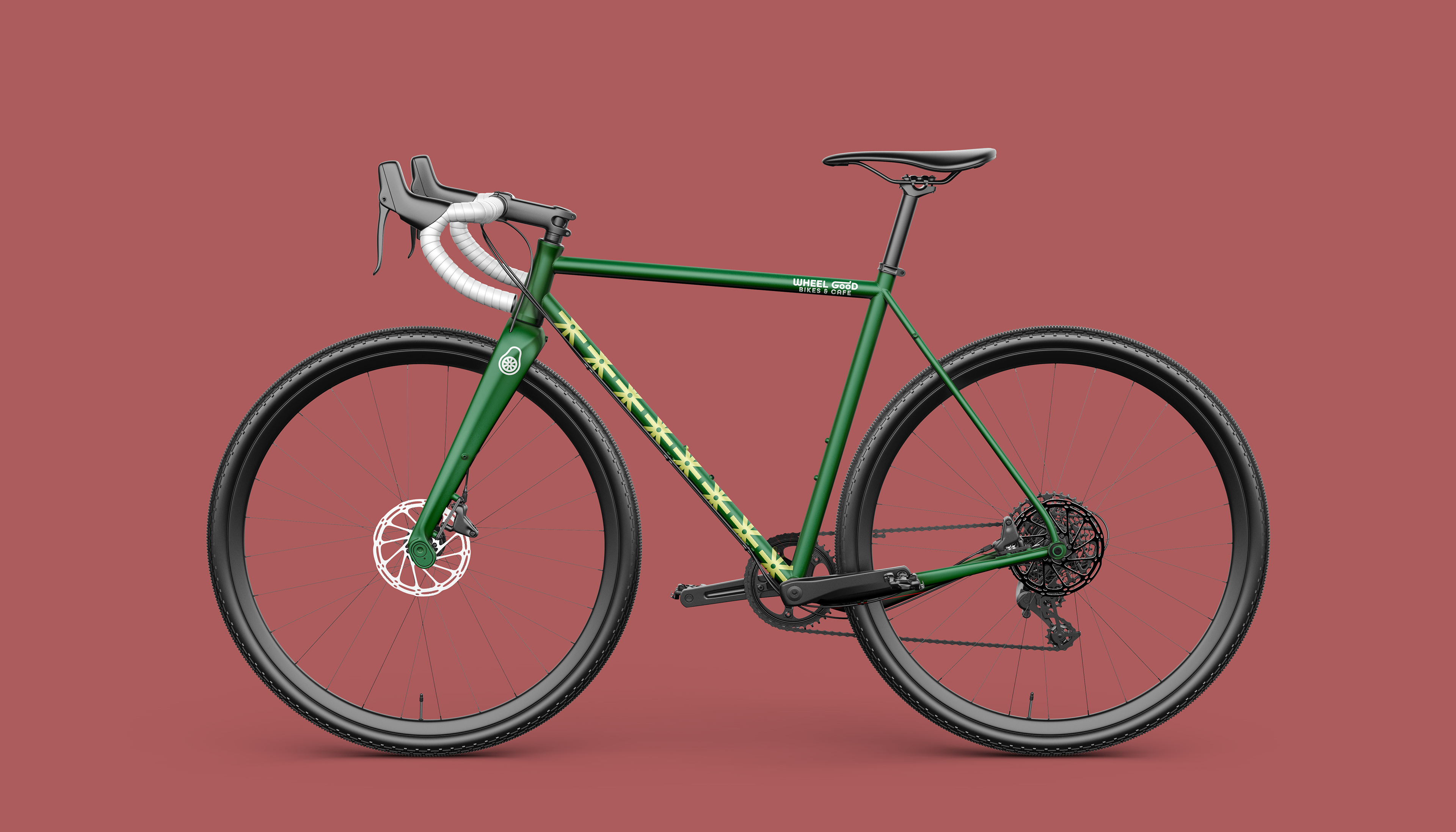
APPROACH: By using recognizable iconography and a lively color palette I was able to create a system that follows the brand voice to feel fresh and high quality. The heavy line weights coupled with forgiving forms create a feeling of friendliness, while the confident colorful graphics help to show a confidence of quality.
AWARDS:
GRAPHIS NEW TALENT ANNUAL 2022
Branding System | Silver Award
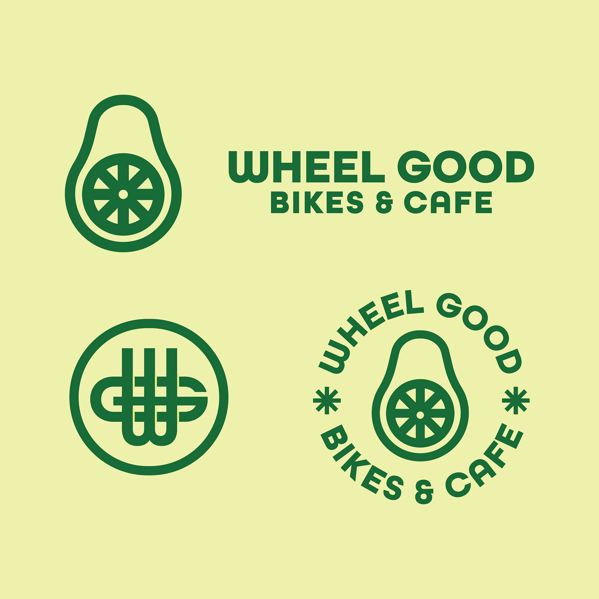
SECONDARY LOGOS
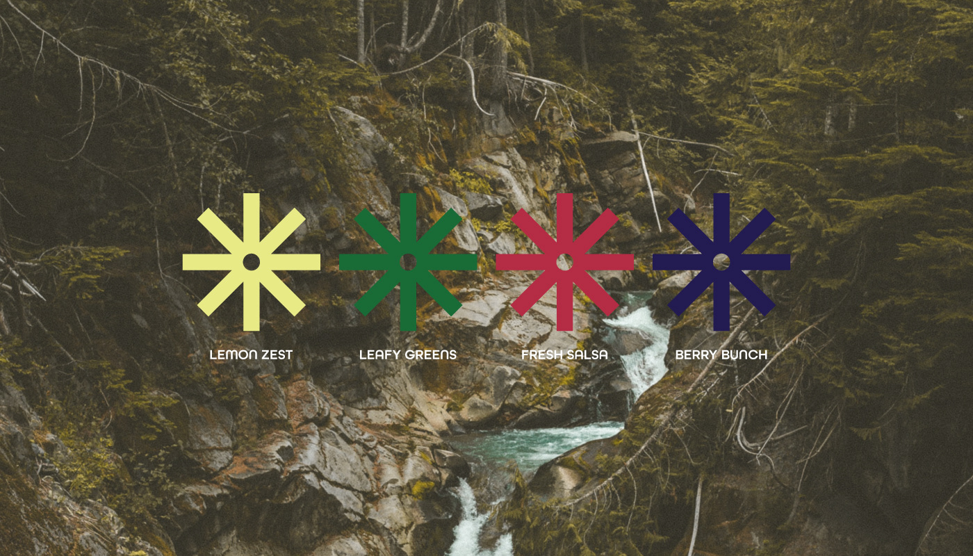
COLOR PALETTE
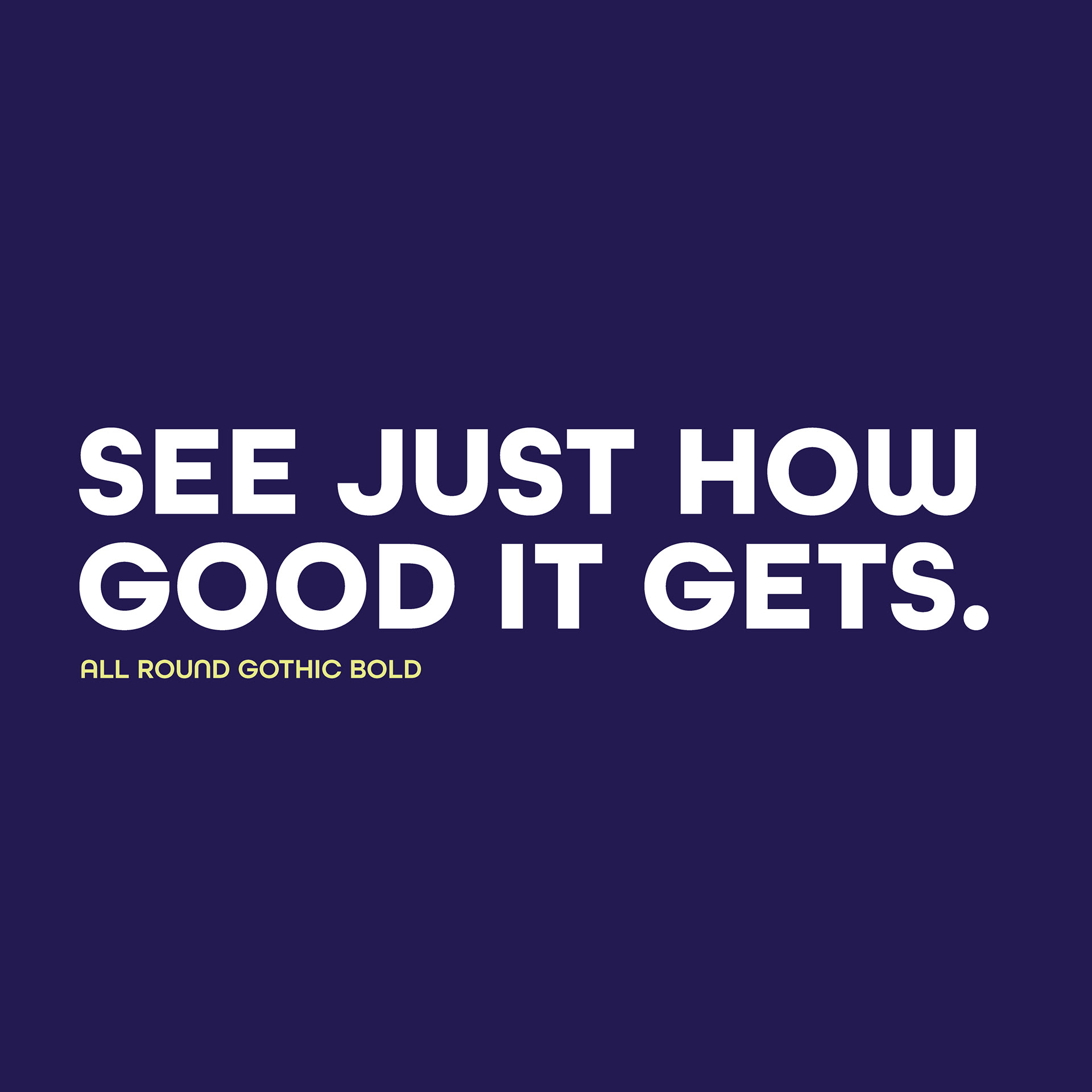
TYPOGRAPHY

USER PERSONA
J0HN, 24 YEARS OLD, HE/HIM
BIO: Local Seattle resident who has been cycling for years. What started as a way to save money on gas has now introduced him to a whole community of local cyclists.
GOALS: To be a healthy person through exercise and eating habits, and to support local businesses.
MOTIVATIONS: To feel more connected to the cycling community, to be confident in the products he consumes, and to be conscious of where he spends his money.
FRUSTRATIONS: Dislikes ordering products online due to lack of confidence in quality. Wants to start eating healthier and cut meat out of his diet but is nervous of where to start.
S.W.O.T. ANALYSIS
STRENGTHS: Strong brand voice and ideals with decades of expertise and the highest quality products, service, and food.
WEAKNESSES: Visual brand representation does not match the brand voice, overall disconnect between high quality standards and visual standards.
OPPORTUNITIES: Expansion of brand voice through visual elements as well as physical elements to help spread the brand.
THREATS: Other bike shops especially low quality shops that can offer lower prices, as well as other local cafes and bars.

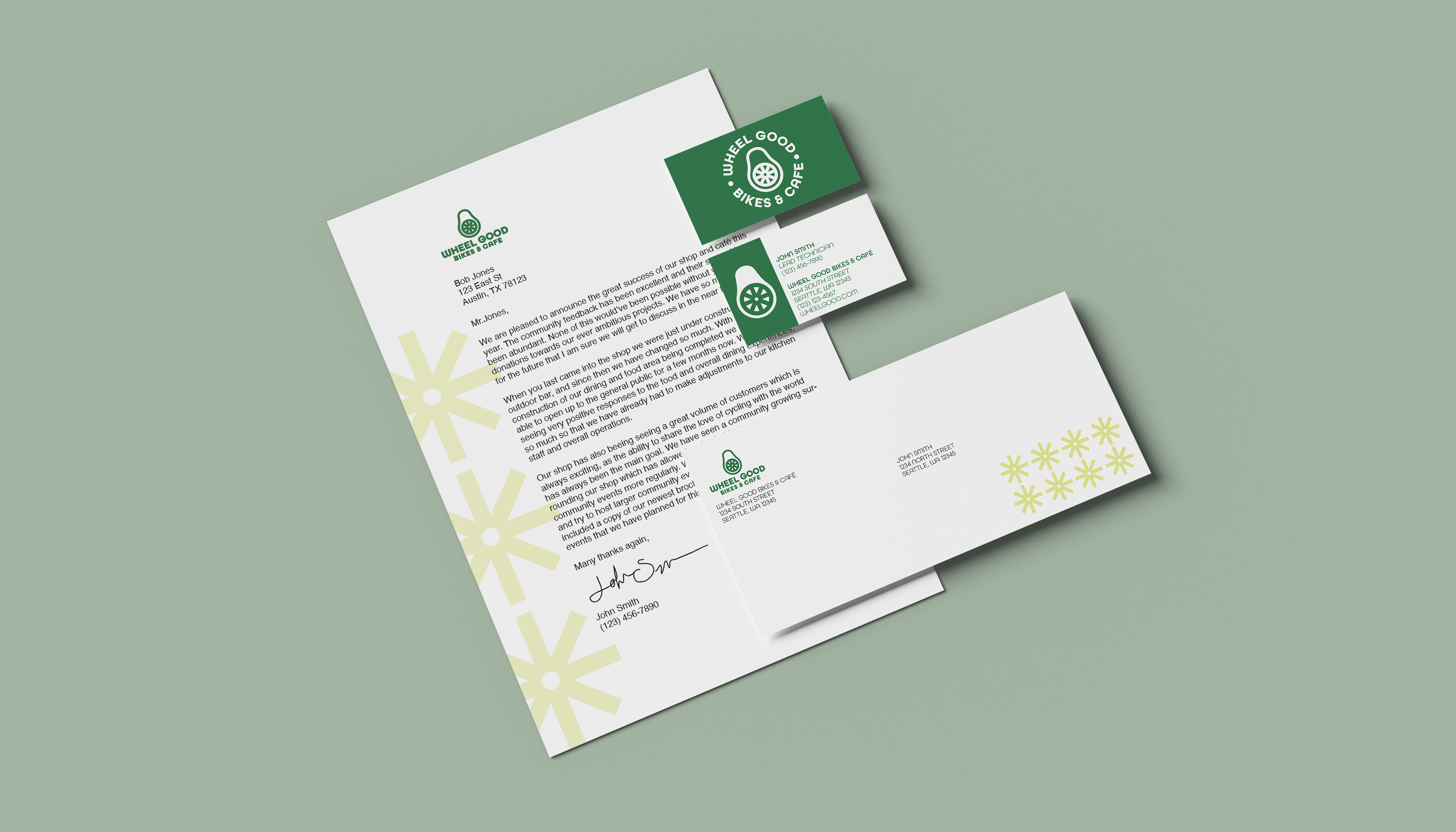
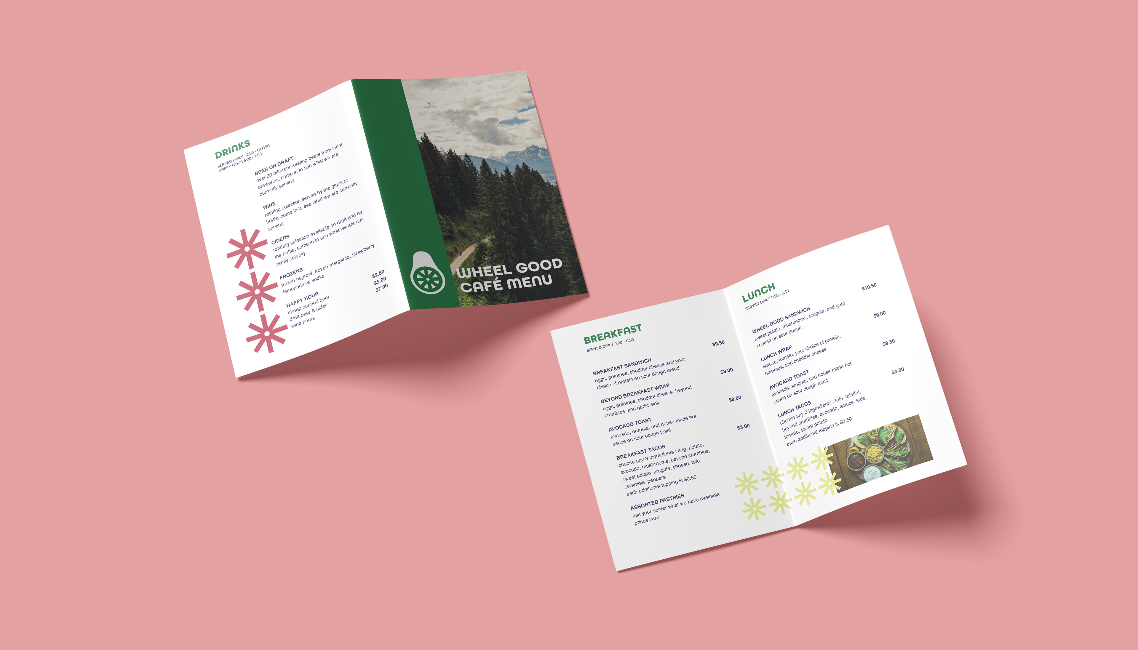

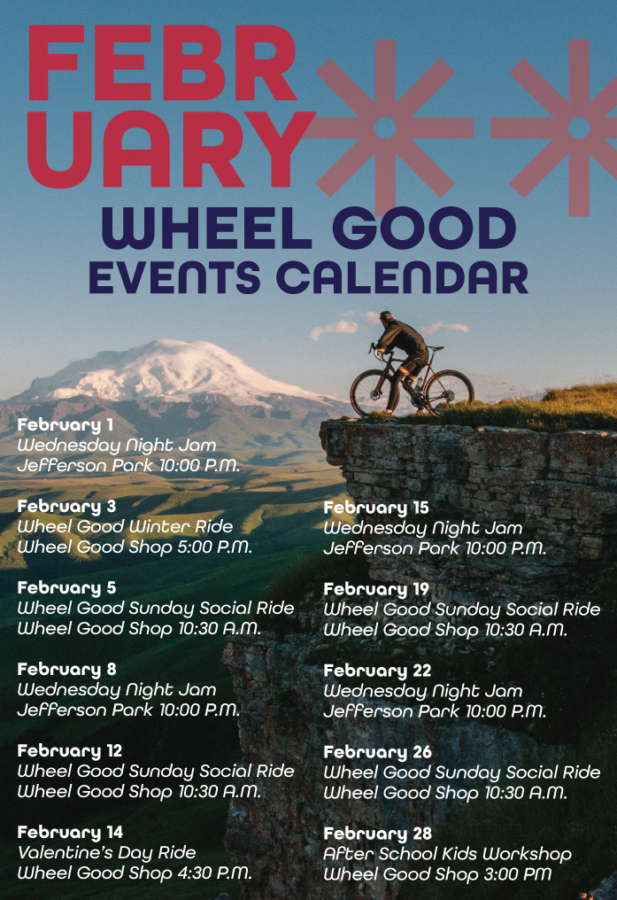
WHAT I LEARNED: With this project I learned that it is okay to take a step back and revisit the foundation of your brand if you are not happy with it. This is now my fourth revision of the trademark, as it was necessary to develop it towards the brand identity that I wanted. I also learned how to push brand identity stronger into editorial pieces, and allow that structure to follow into things like menus and stationery.
WITH MORE TIME: I'd like to see what it would look like to see what an event by this shop would look like, or a pop up for the cafe at said event. There is so much opportunity for branding within this and it would be a very fun project.