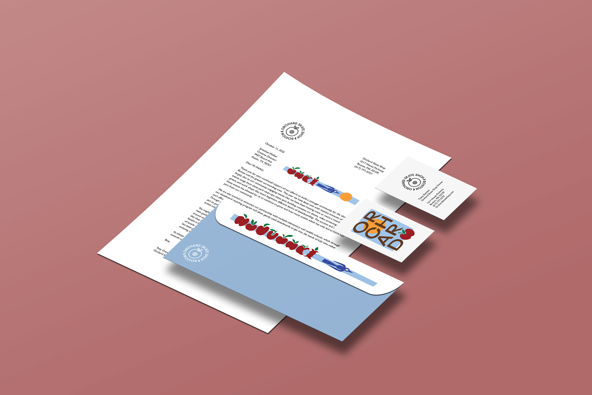
BRANDING AND TRADEMARK DESIGN
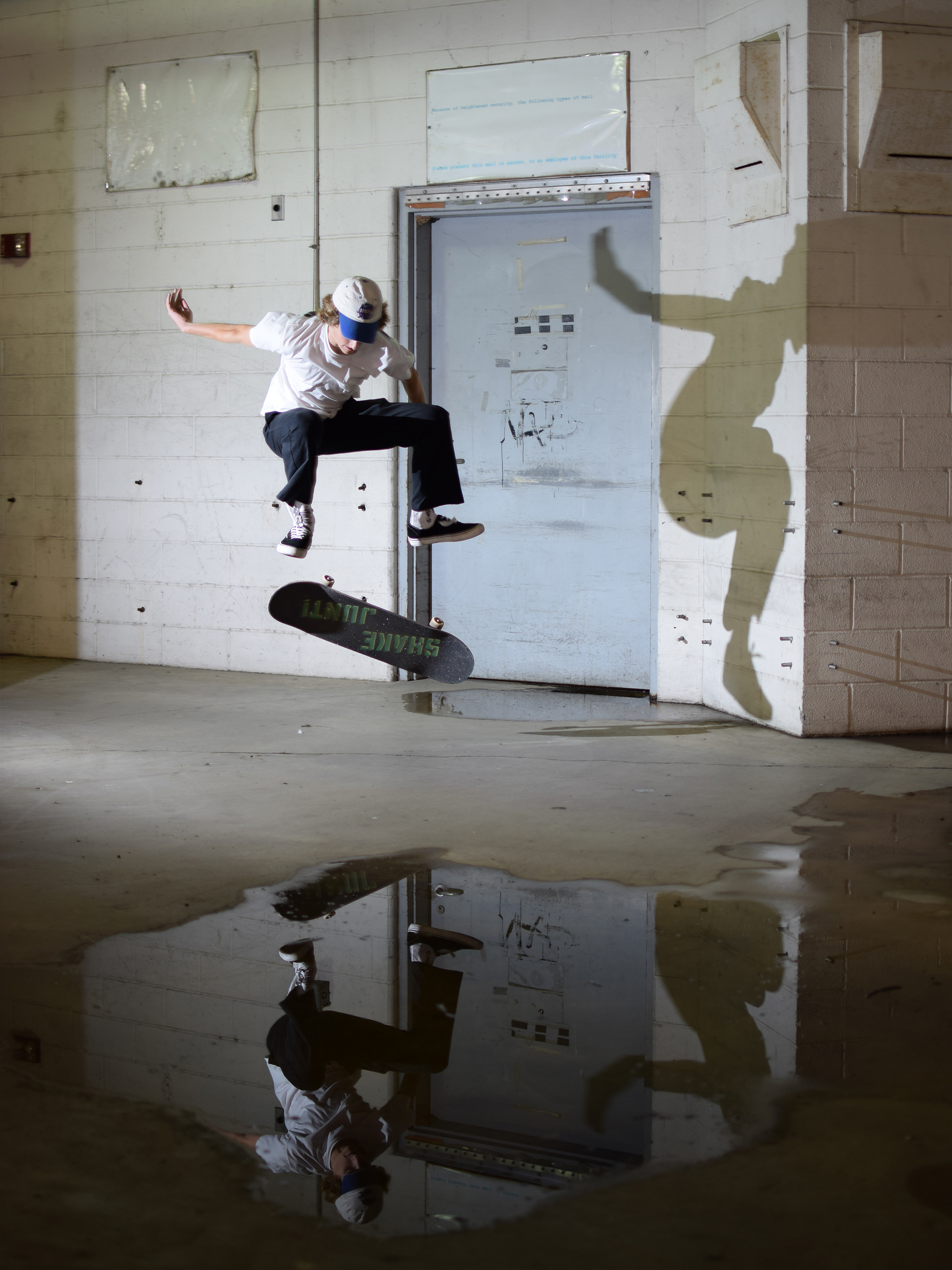
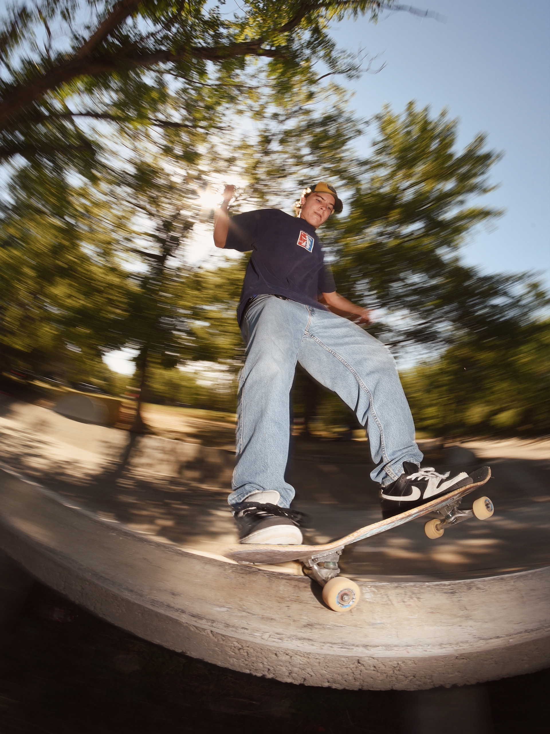
OBJECTIVE: To create a proposed rebrand for orchard skate shop that does not feel bound by age, gender, or experience, and is focused heavily on environmental impact, as well as supporting the local skateboarding community.
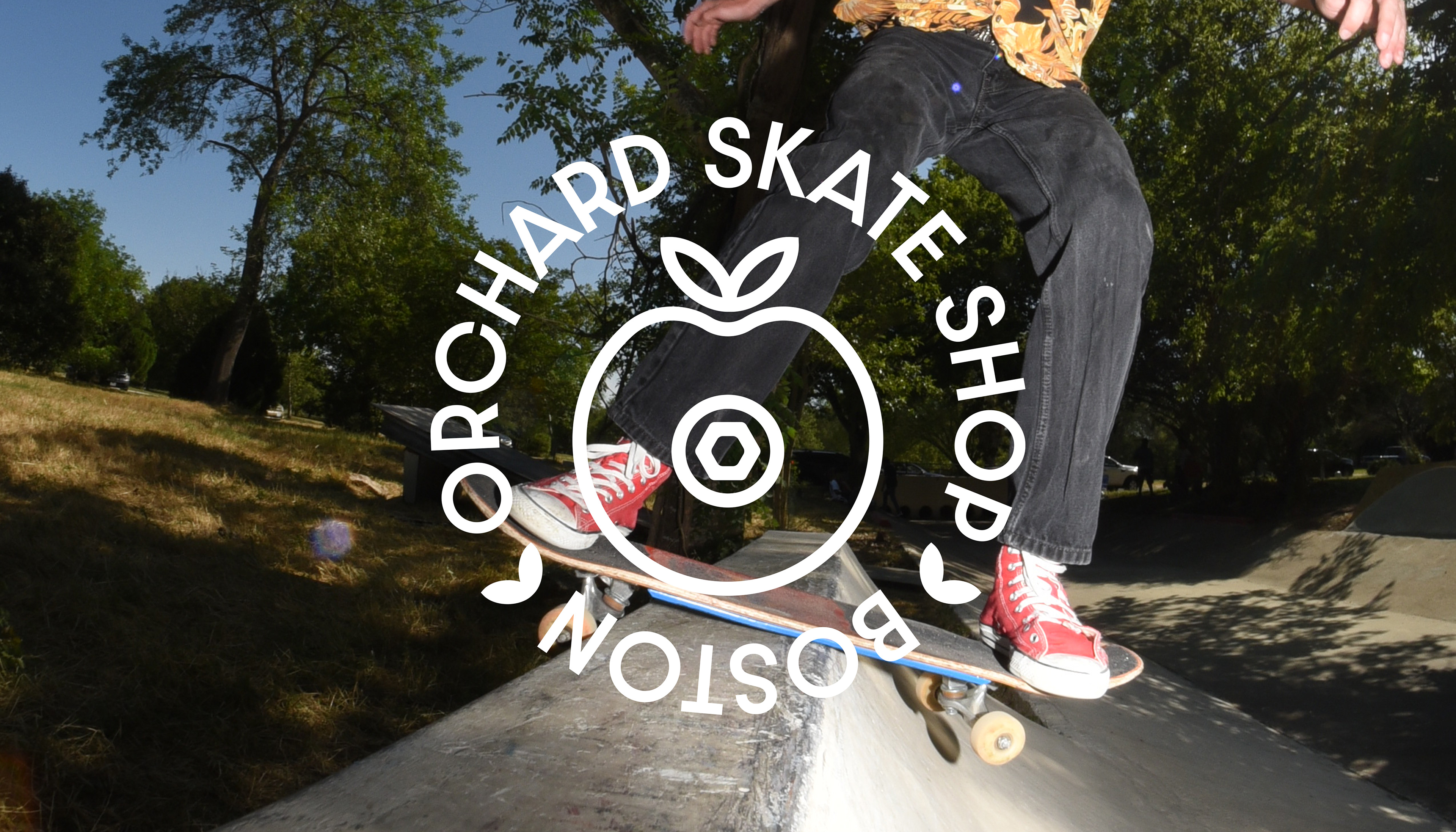
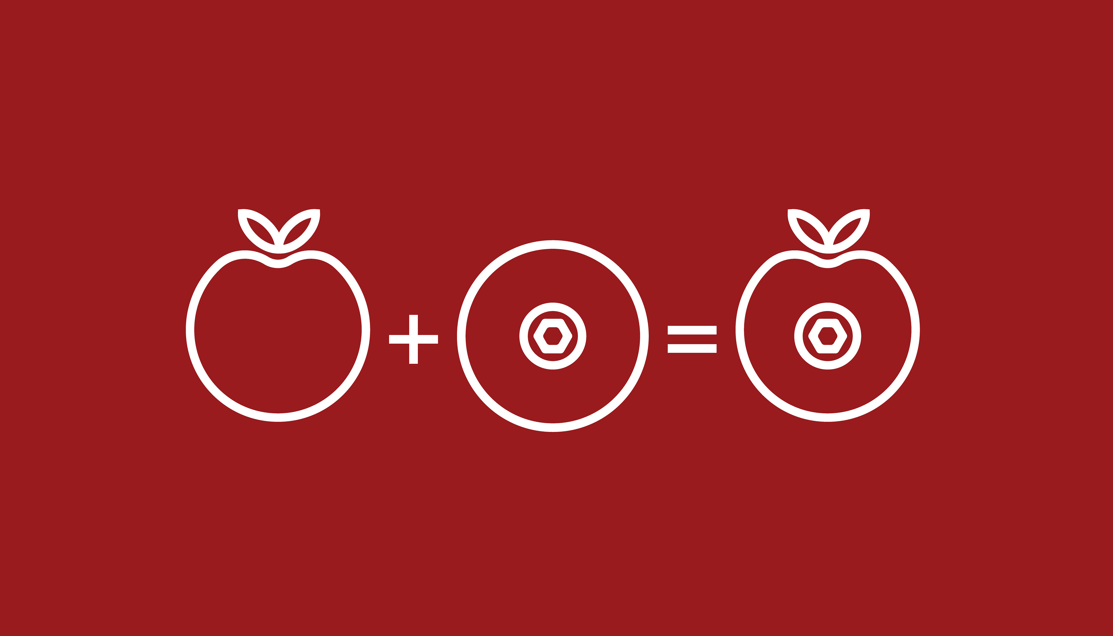
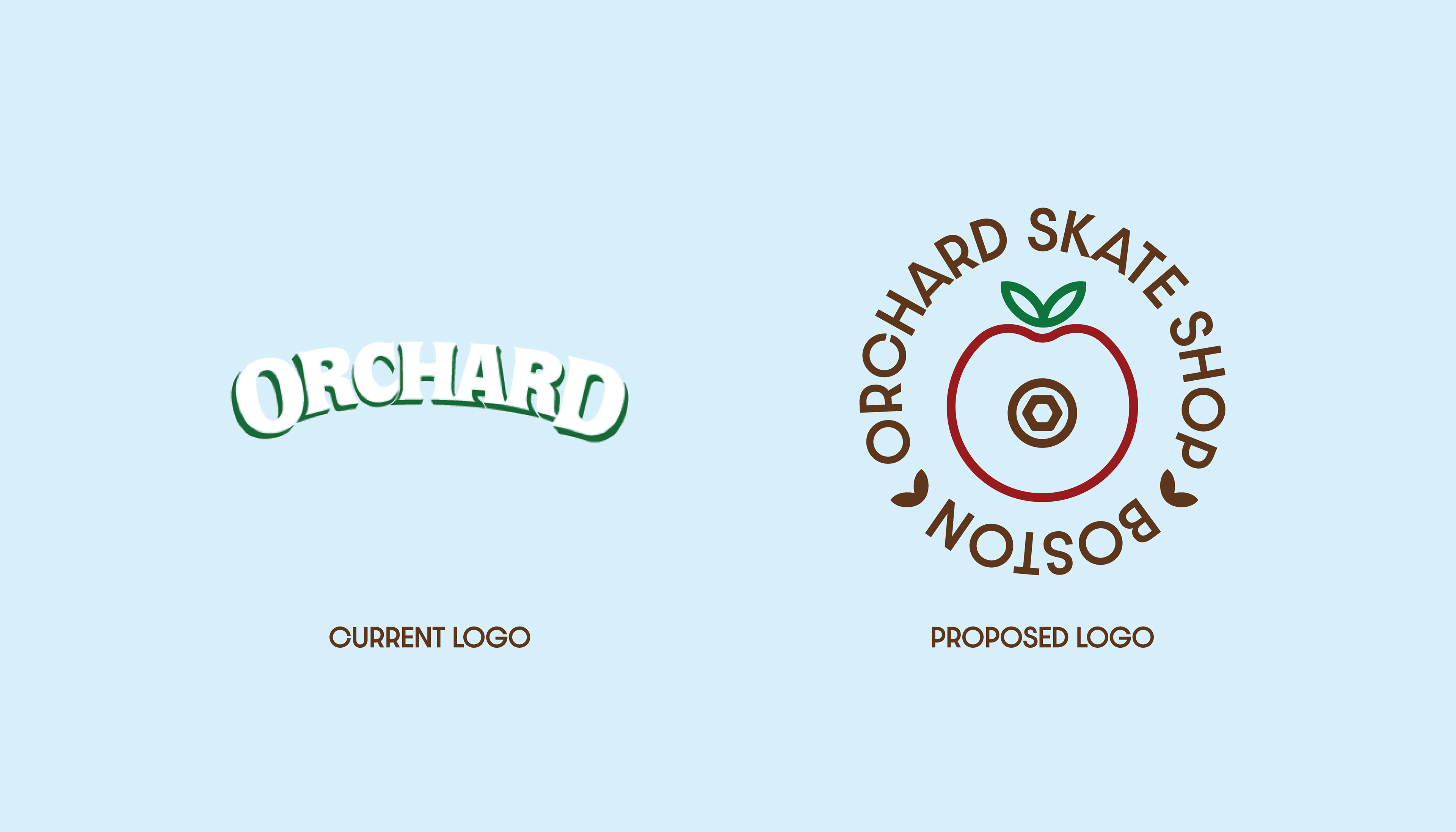
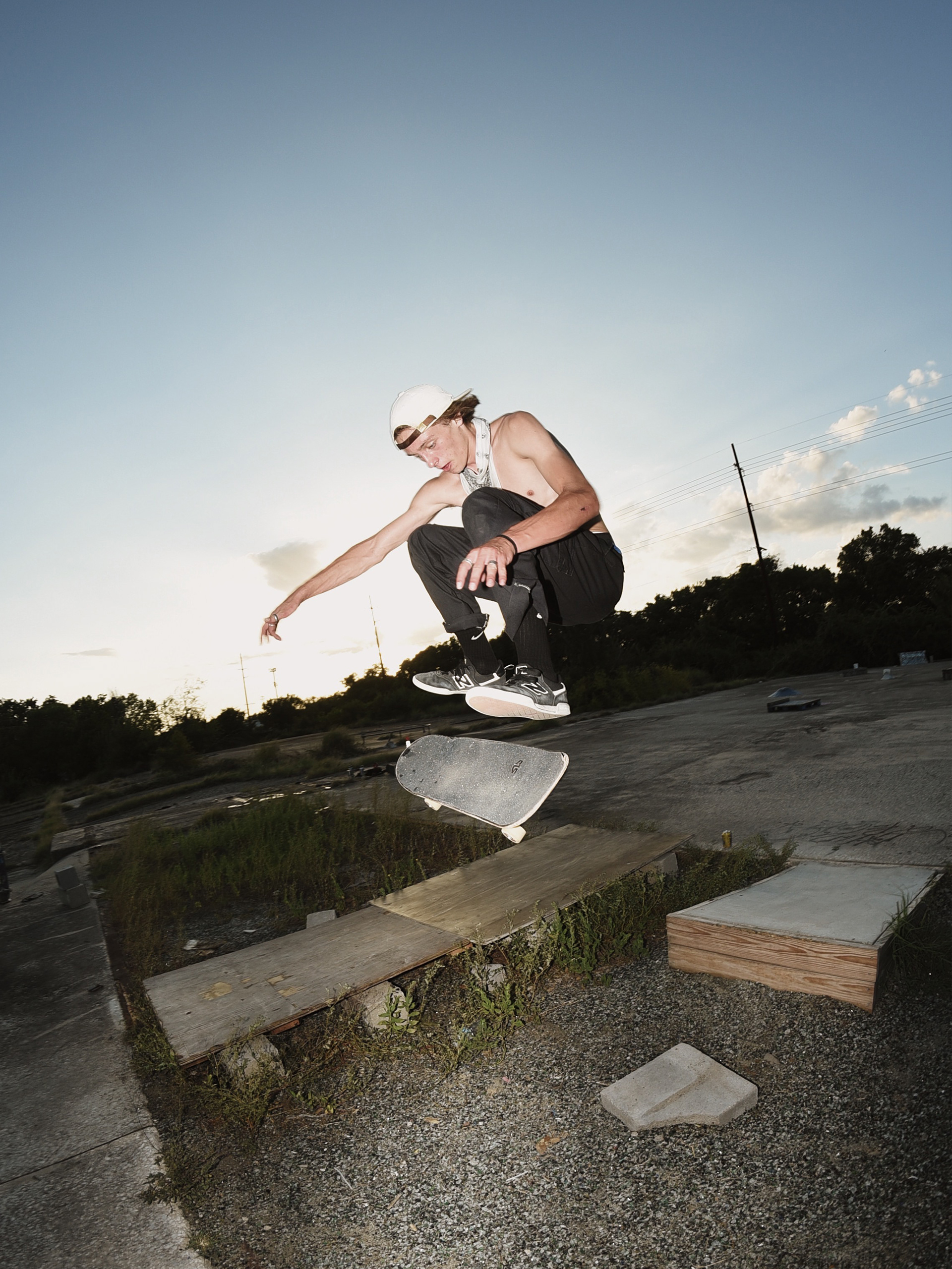
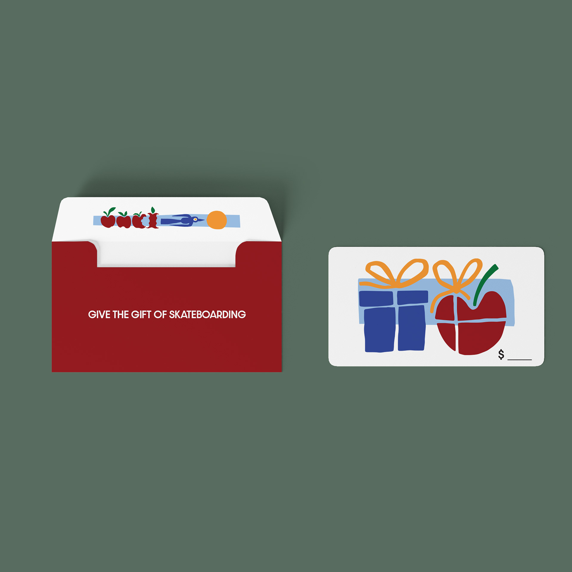
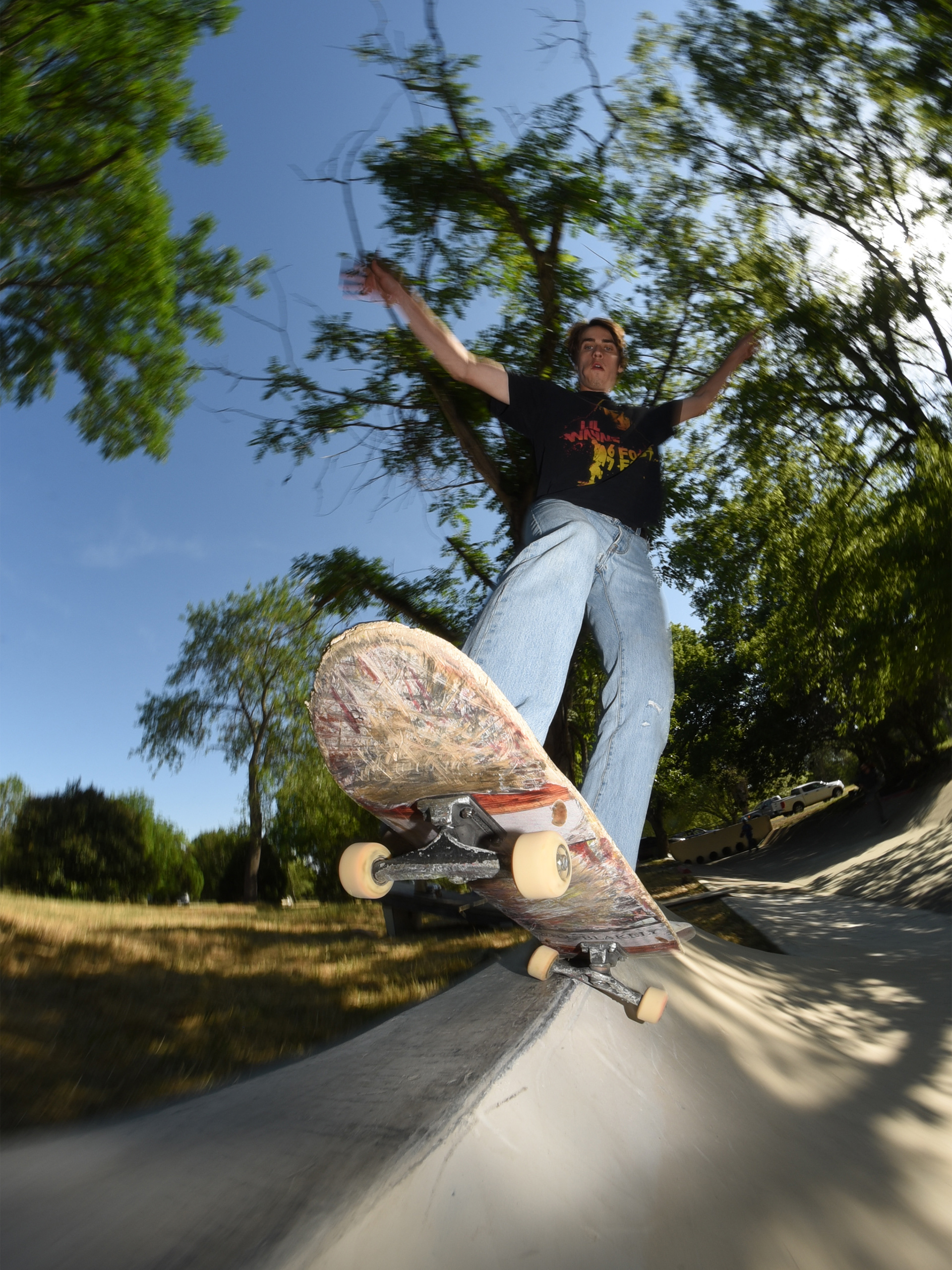
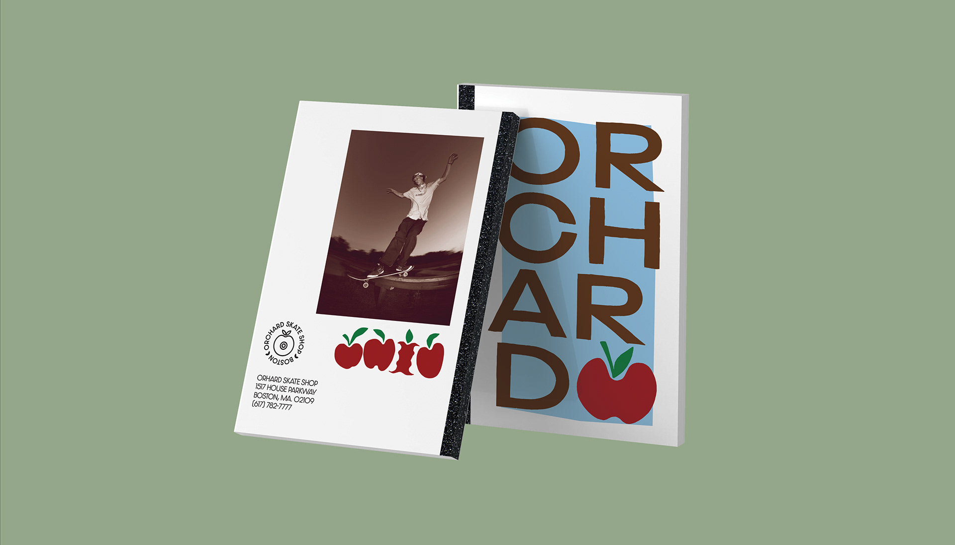
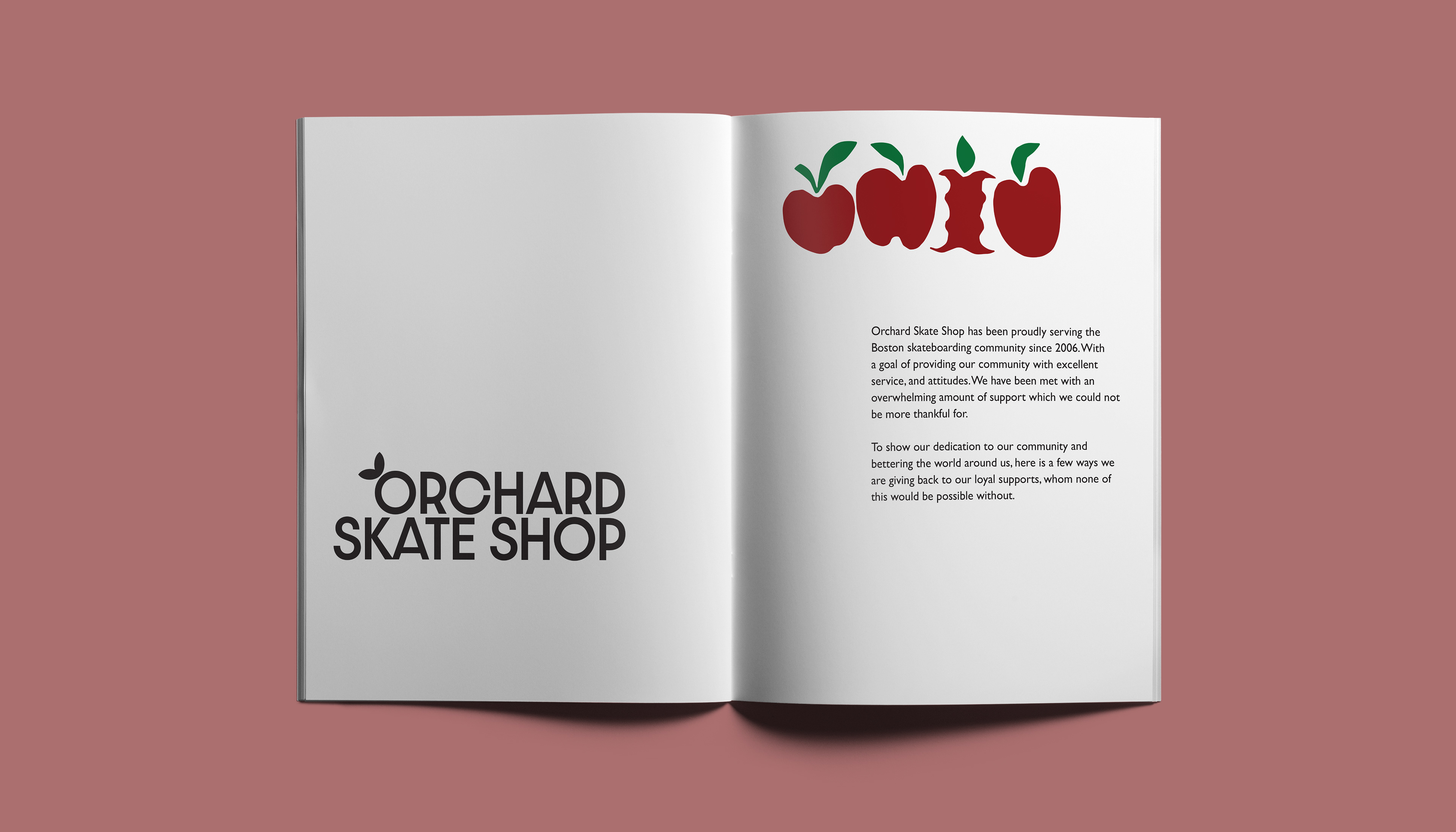
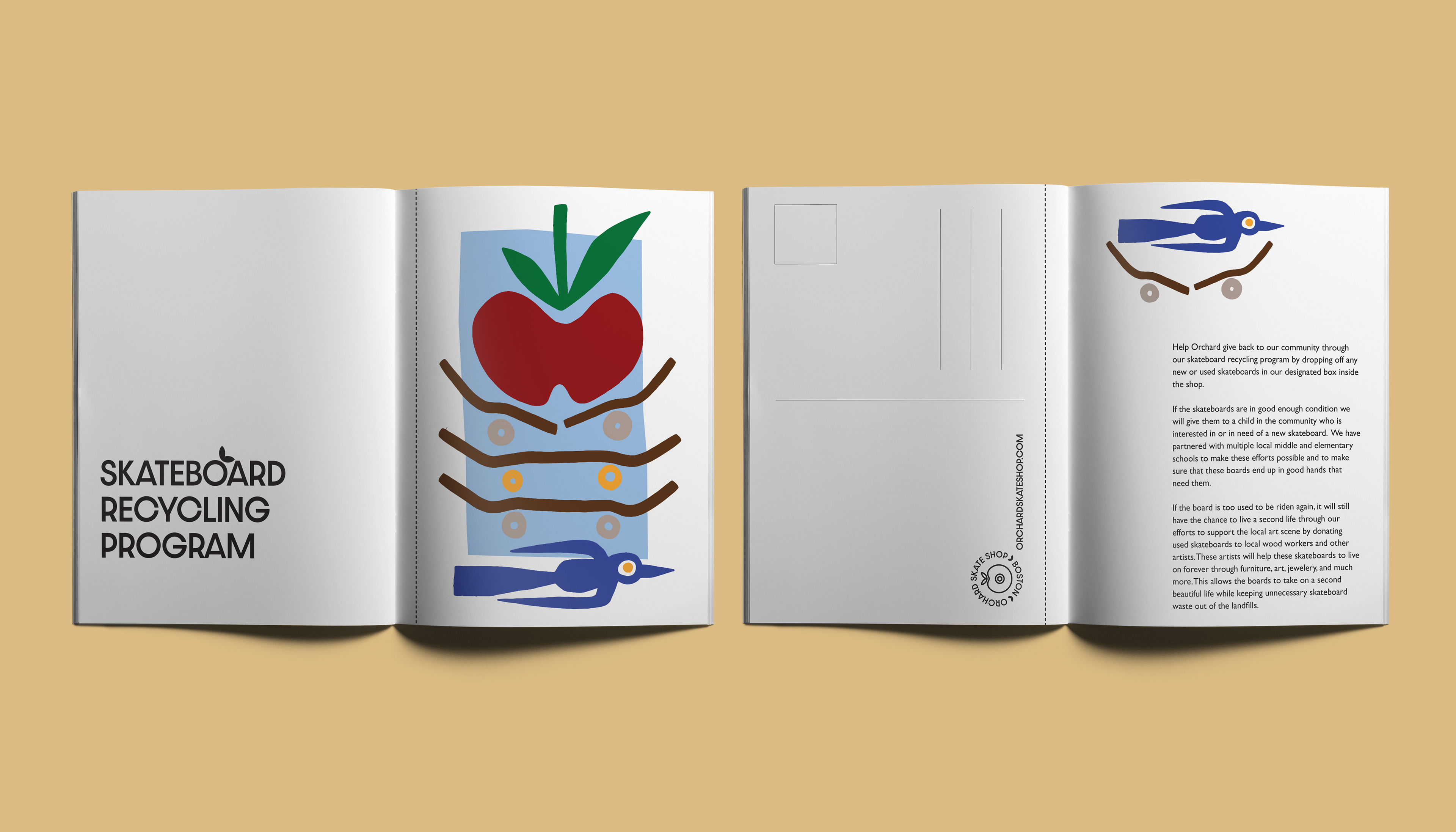
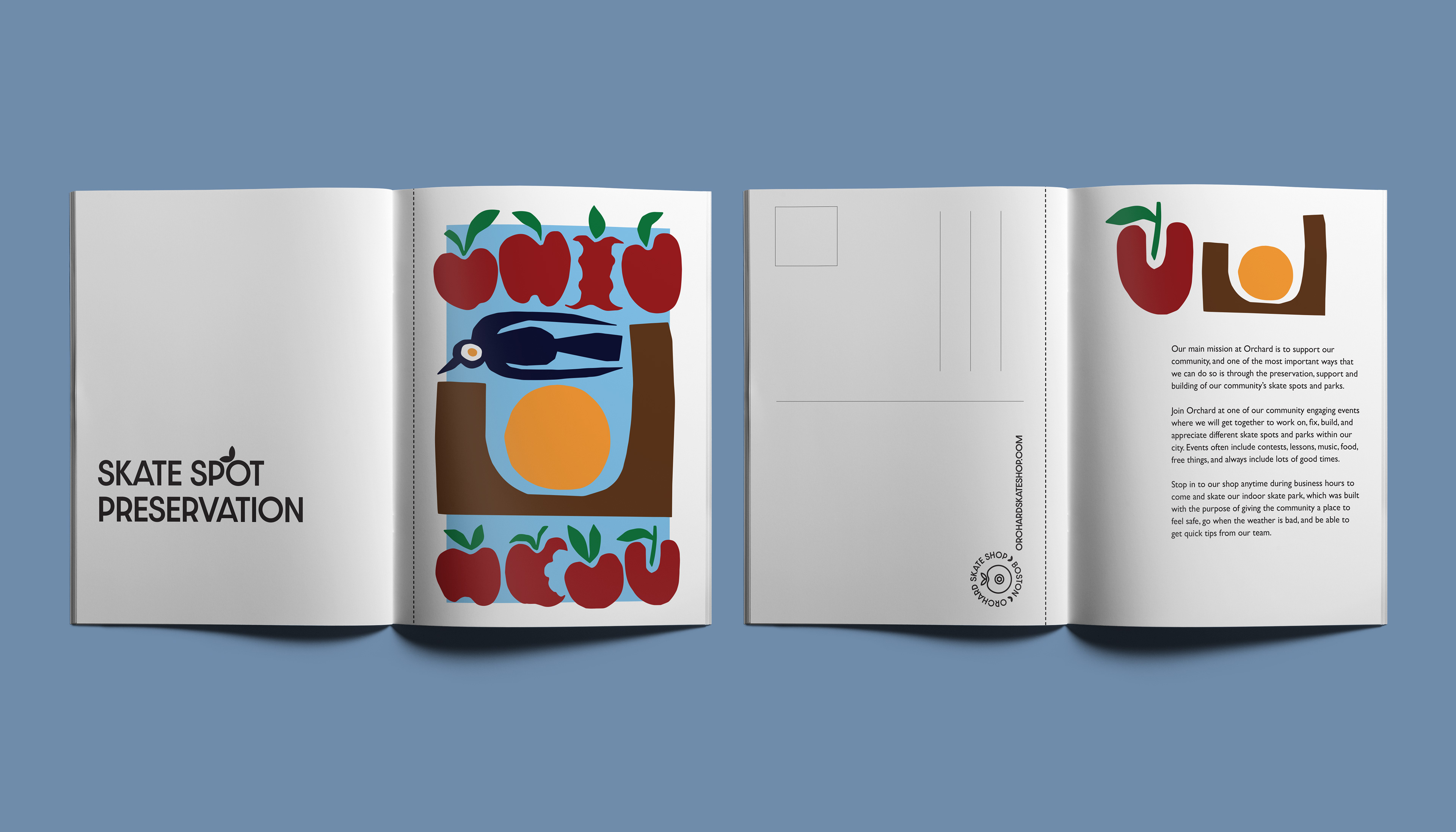
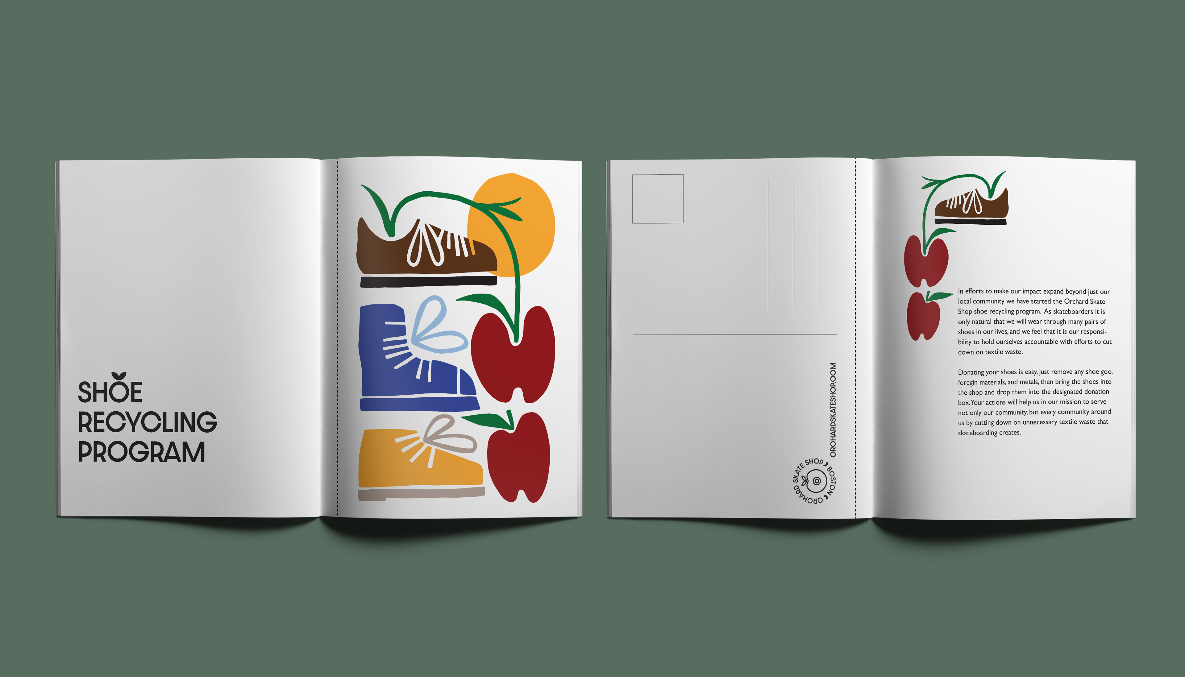
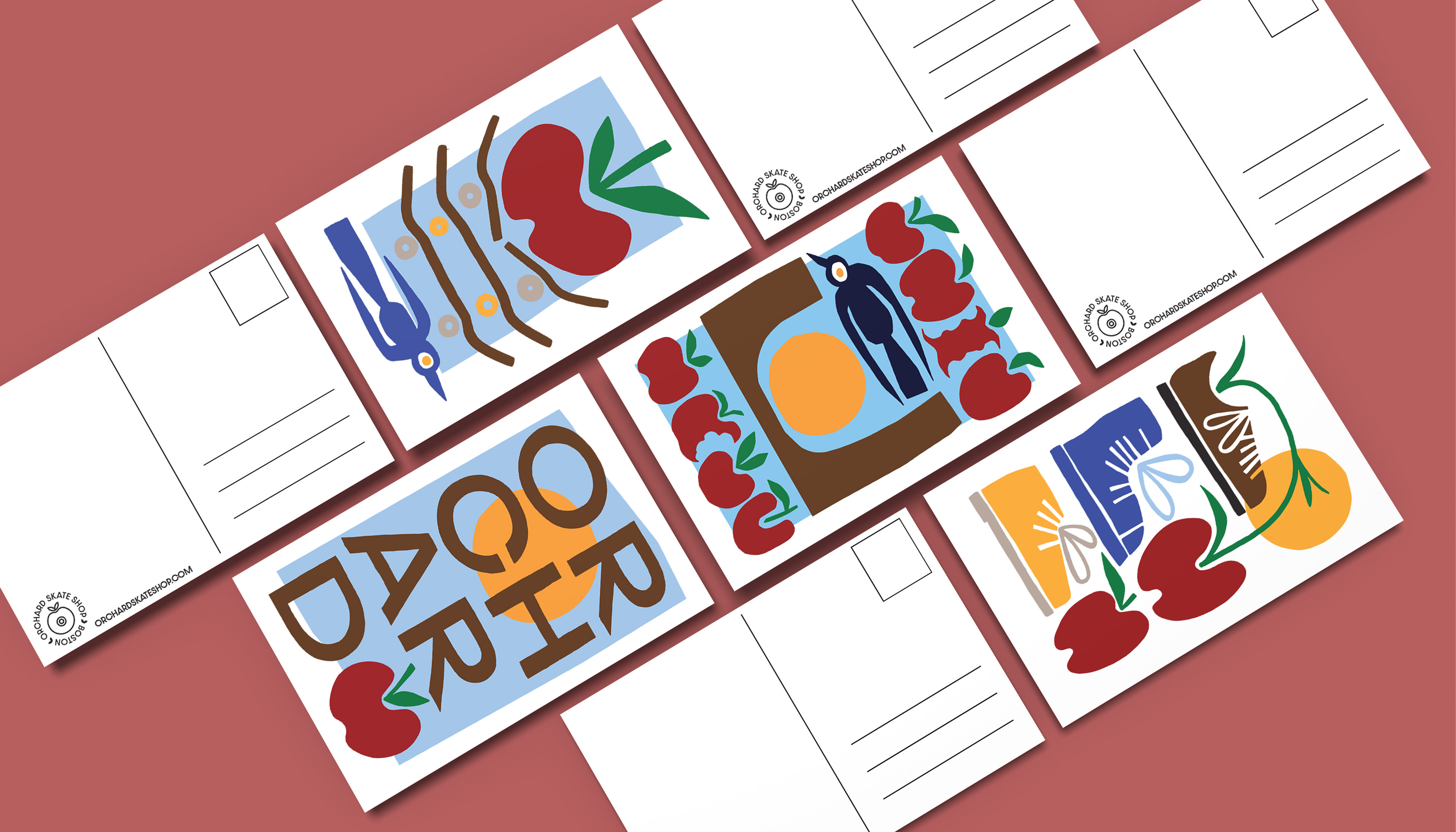
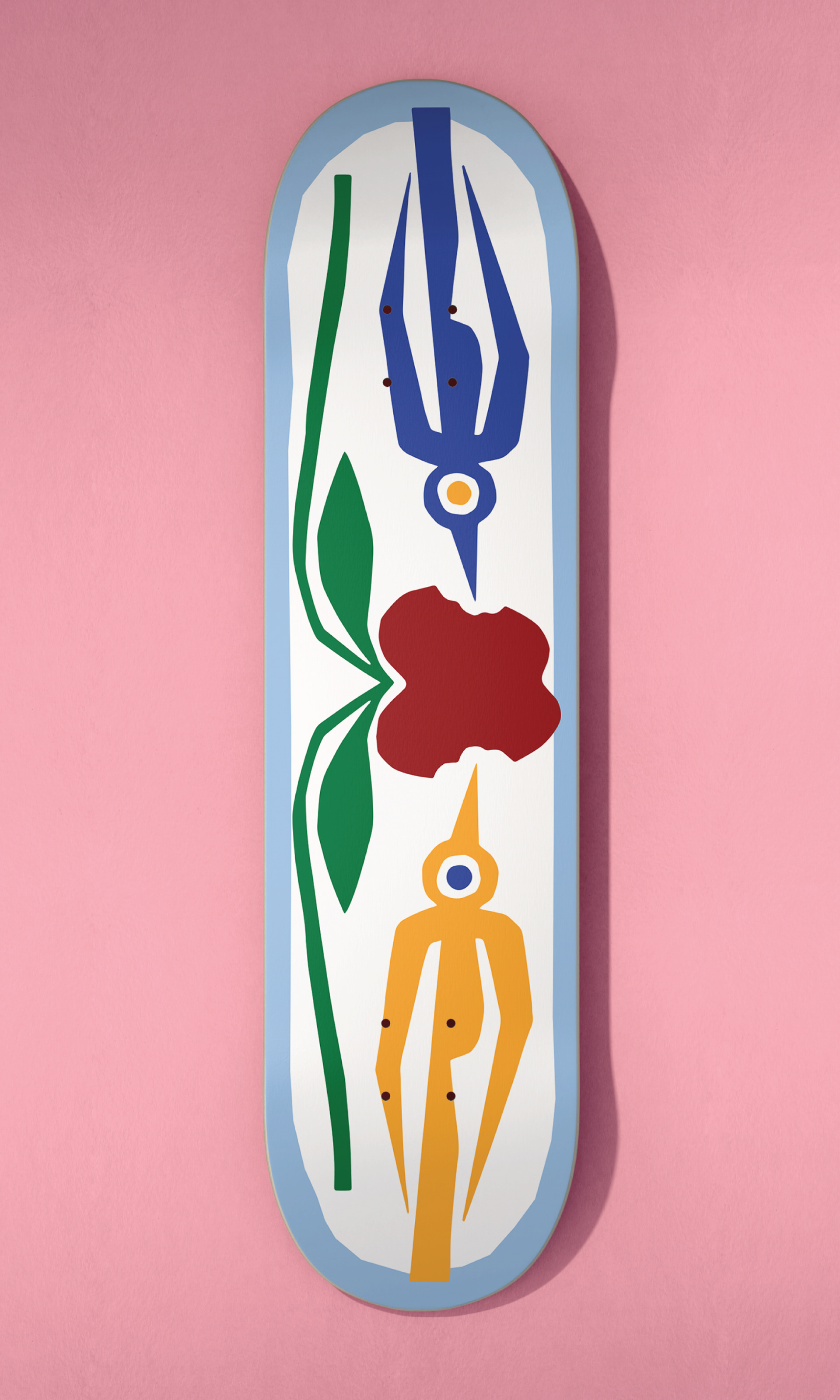
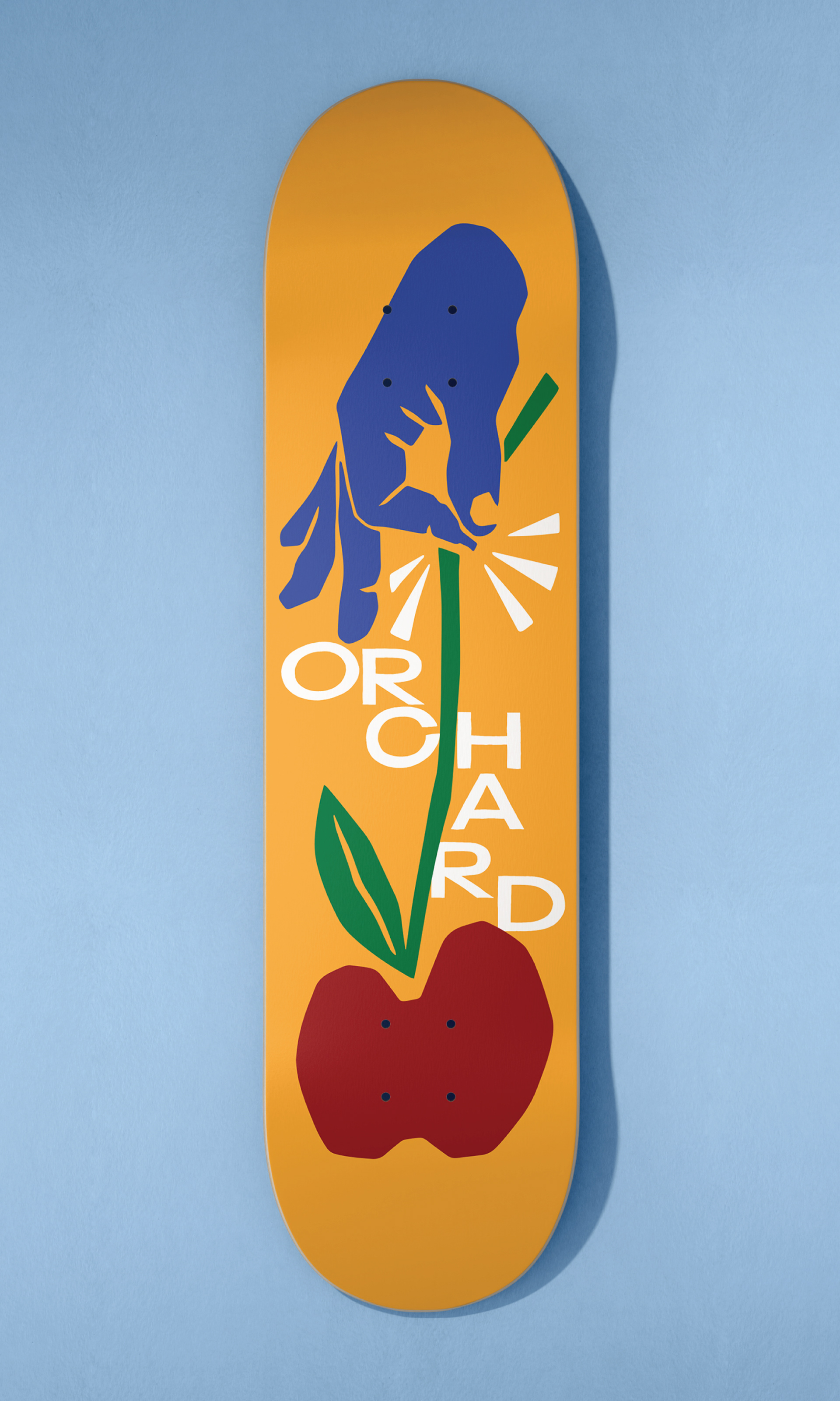
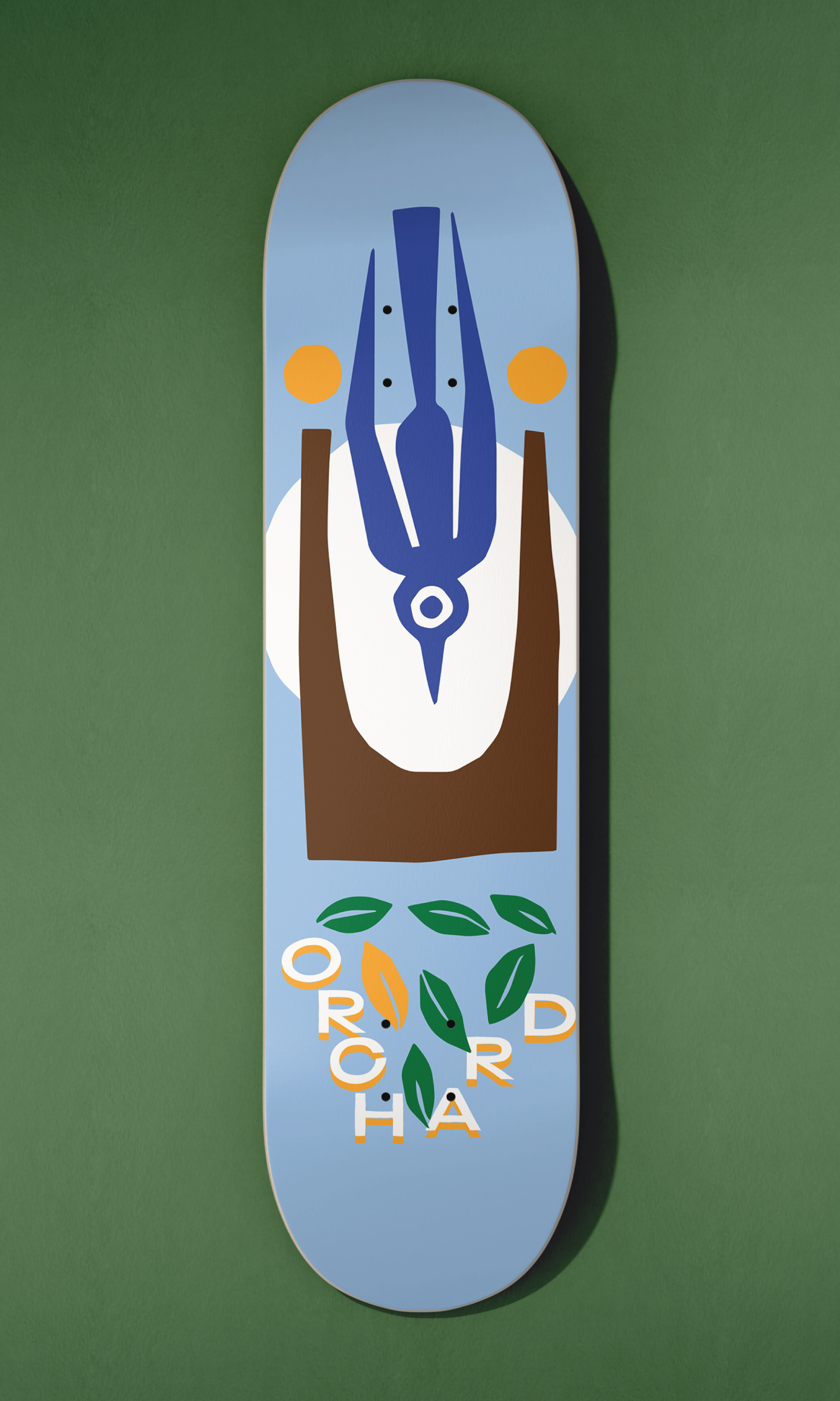
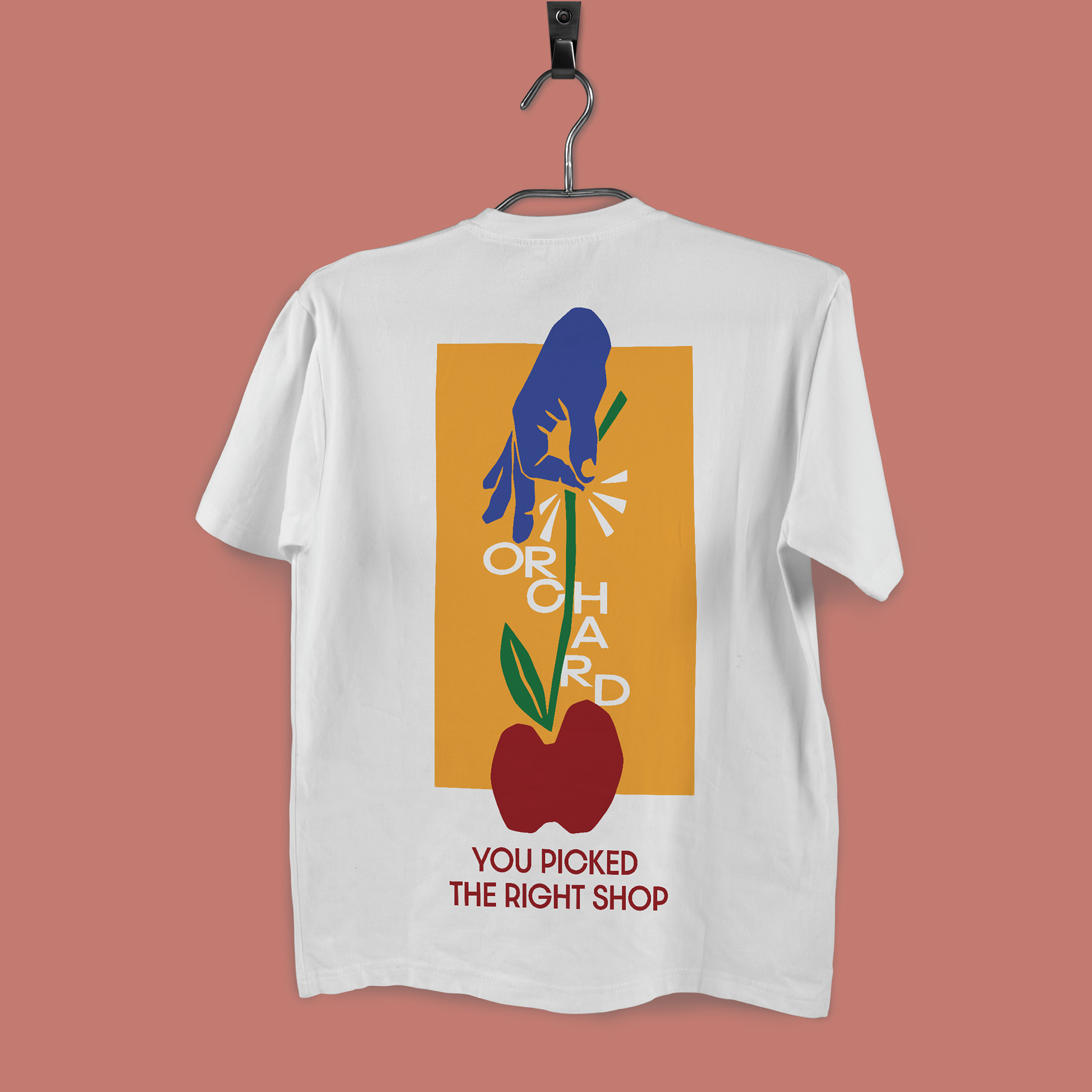
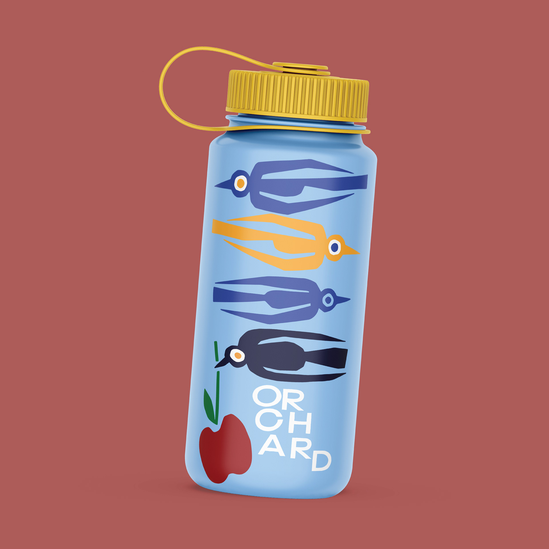
APPROACH: With a goal of diving into the brands identity I chose a color palette and illustration style that drew equal inspirations from nature, skateboarding, and community. A color palette based around primary colors gives a nod towards the colors that can easily be found in nature, while also referencing the lively nature of skateboarding from the graphics to the clothing. Illustrations were used to create motifs that can be seen throughout the project such as apples to create a strong and easily recognizable brand identity, while also focusing on highlighting the connection between skateboarding and nature.
AWARDS:
GRAPHIS NEW TALENT ANNUAL 2022
Brochure / Editorial | Silver Award
Branding System | Honorable Mention
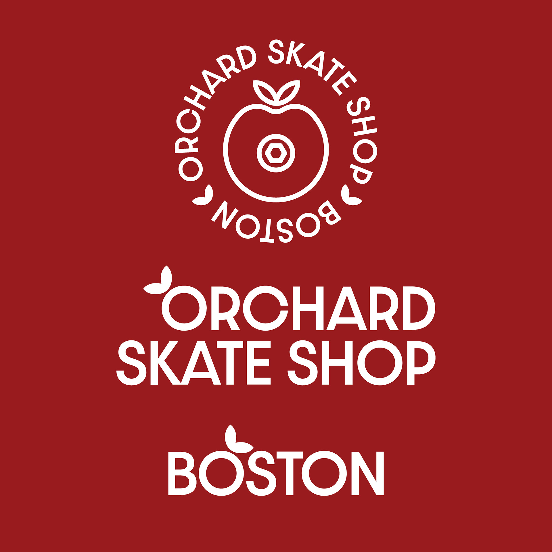
SECONDARY LOGOS
TYPOGRAPHY
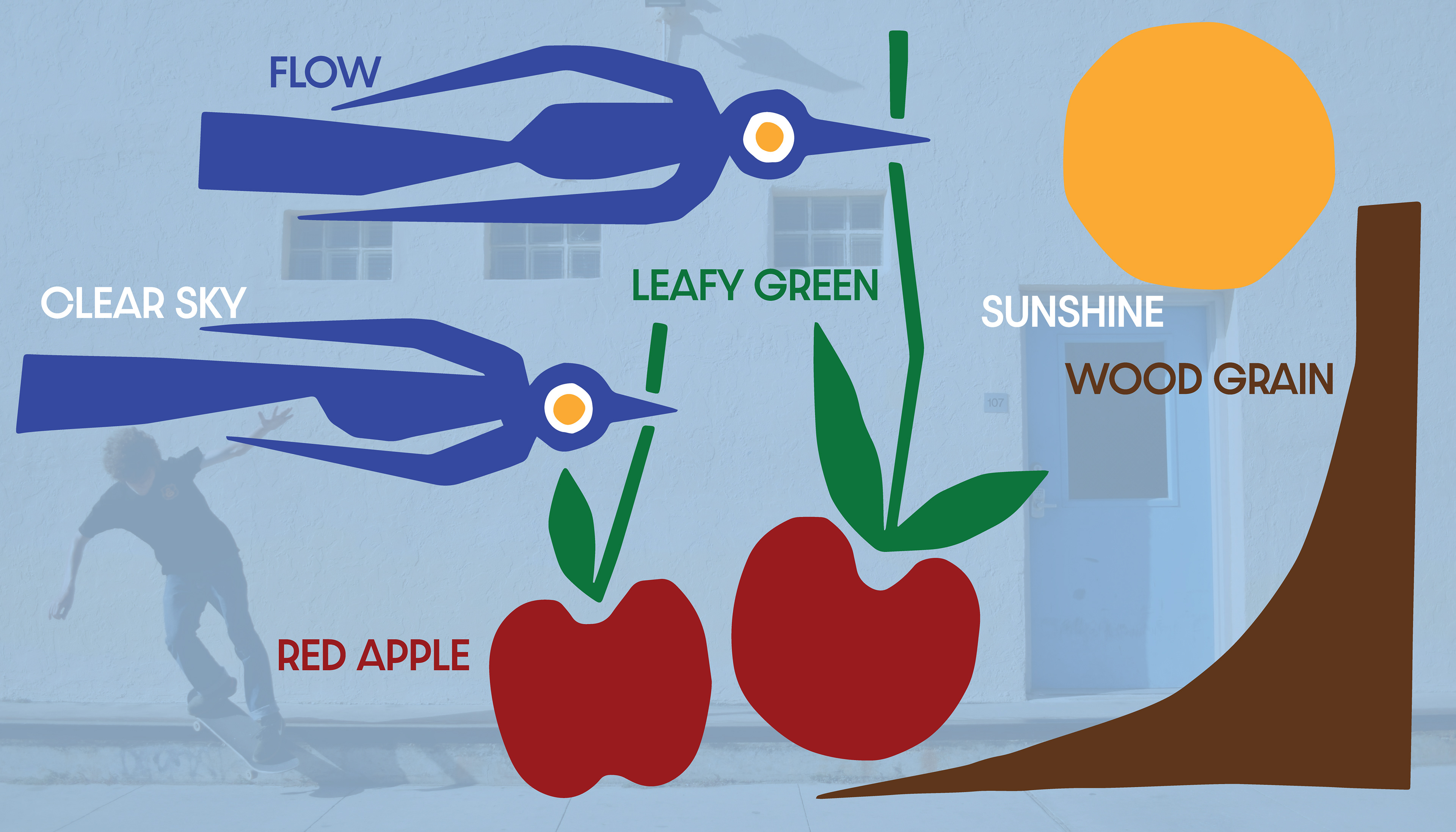
COLOR PALETTE
USER PERSONA
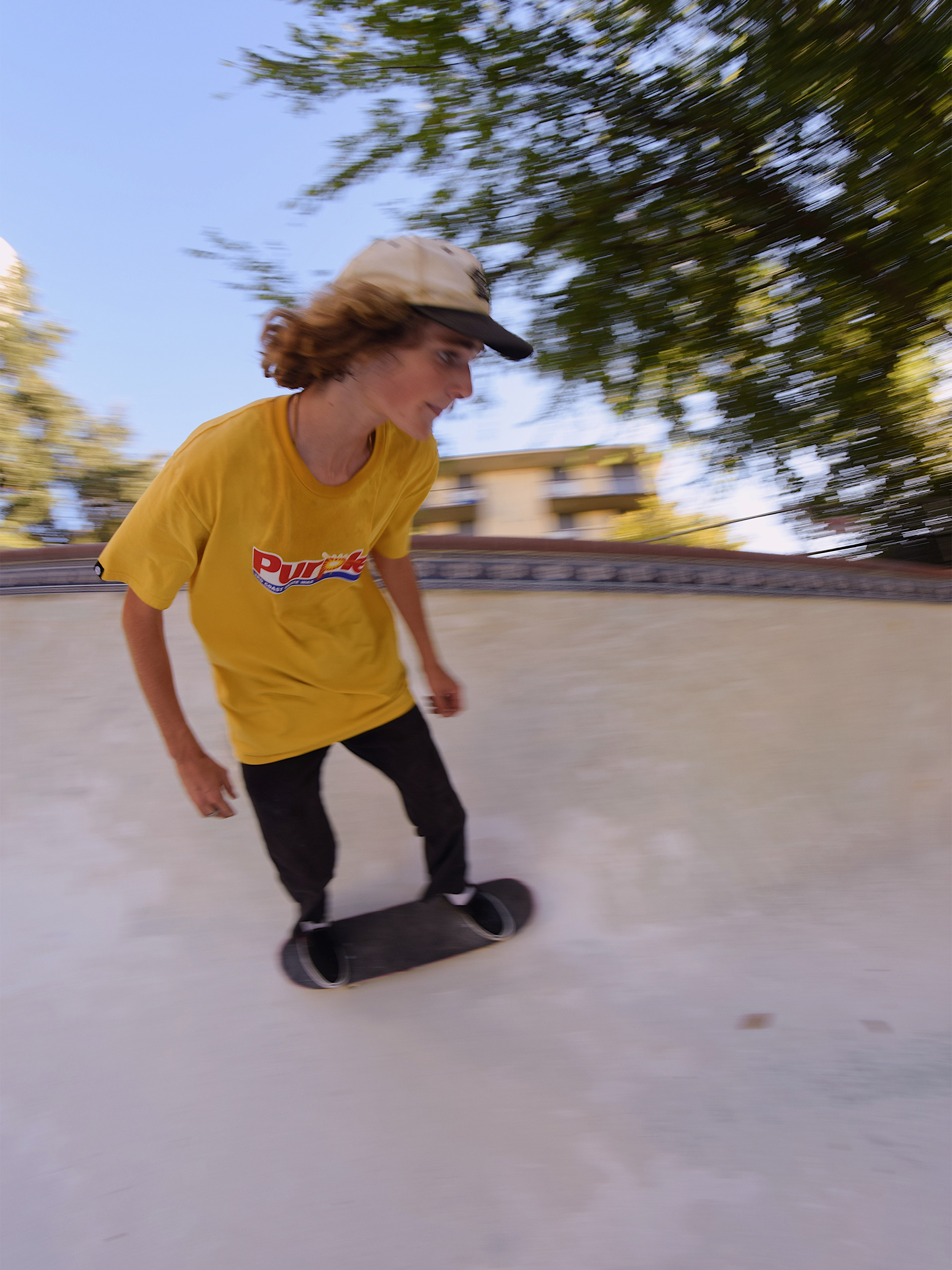
ROB, 21 YEARS OLD, HE/HIM
BIO: Young college student studying painting at his local college. Has been skateboarding since he was a child and skates every free chance that he gets.
GOALS: To become a better skateboarder, skate as many spots as possible, and meet more people in the skateboard community.
MOTIVATIONS: To have a wider group of people to go skate with, places to go skate, and the ability to get exactly what he wants any time he needs.
FRUSTRATIONS: Dislikes having to wait for online orders to come in. Doesn't like that lots of the street spots have problems making them harder to skate.
S.W.O.T ANALYSIS
STRENGTHS: Community engagement through different events, prioritization of our community through preservation of skate-spots, and environmental recycling programs.
WEAKNESSES: Other shops are more known for online shopping, whereas being a shop so centered on our community most of our business is done in person
OPPORTUNITIES: Emphasizing and promotion of our different recycling programs and community events.
THREATS: Online shops and chain stores that might provide lower cost goods at a reduced price point.
WHAT I LEARNED: This project was my first real dive into a branding system, and the lessons that I learned from it could go on. It was a great opportunity for me to learn to embrace illustration within a system and specifically within an editorial format. This also really taught me the importance of a unique and well established brand voice, and how to apply that brand voice without being too repetitive.
WITH MORE TIME: I would love to dive deep into systems such as an event put on by the skate shop, and also experiment with EGD and how this illustration style could come to life through way-finding and signage.